Two years ago, I got a call from the clearance office of Paramount Studios, asking for permission to use one of my Desert Storm posters as part of the set dressing in the upcoming film G.I. Joe: Retaliation. It had to do with Saddam Hussein riding on a camel, surrounded by all kinds of military aircraft and Coalition war machines. While in the process of saying yes, I directed them to my website and asked if they wanted any of the others. Their answer was also yes, so I sold them two copies each of several pieces of art. They wouldn’t give me a screen credit, though, or even a thank-you at the end of the feature, but I was still looking forward to seeing my artwork up on the silver screen. When it finally came out, I scrutinized the background of every scene, but apparently they decided to go in a different direction, or else the scene with my stuff in it was edited out. Oh well, it wasn’t the first time my stuff ended up on the cutting room floor. But there is still some hope: a few months later, the same office called and also asked if they could use that Saddam poster in Stallone’s film Home Front.
Now I’ll have to rent the video and see if it made the cut.
Back when I was an Army officer, people would occasionally pay me to draw a color caricature of a friend, spouse or superior. Inspired by the satirical styles of George Finley (military posters) and Mort Drucker (Mad magazine), these marker posters were chock-full of jokes and jibes that spoke to the subject’s history, interests, catch phrases, and personality quirks, as well as plenty that just poked fun at military life in general (as opposed to military life in private or corporal).
Finley was famous for his published posters skewering the various combat arms branches, and what I considered his masterpiece depicting a beleaguered Action Officer (maybe because it had so many little jokes tucked away in all that desk-jockey’s paperwork, or maybe because I had served a stint in a similar staff position and could relate). However, I was a Signal Officer whose first assignment was in a Military Intelligence battalion, and many of my colleagues felt they’d been left out.
Hence my first published poster, “M.I.” It seemed to me that, deep down inside, virtually all intelligence personnel saw themselves as a step or two away from being James Bond, so that’s the angle I took. The poster was a success, selling out of its first two printings, and now I sell a smaller version from my own little print-on-demand website.
I quickly followed up with two other posters, one showing the day-to-day trials of “The NCO” in a typical barracks environment. The sergeant is admonishing one of his soldiers with a phrase familiar to all men and women in uniform – and supposed to be somewhat of an insult to officers, although I always thought it was funny – “And stop calling me ‘sir!’ I work for a living!” The other one was targeted at the entire U. S. Air Force. In it, a pilot is telling a whopper of a war story to a skeptical member of the ground crew with that famous opening line, “There I was. . .”
I still do the odd caricature now and again, but I realize that people can’t always afford the fully customized version. However, the advent of computer graphics has made it possible to design a template for doing a semi-generic version. Each piece is on a separate layer, and can be swapped out or modified to fit a specific person or military unit. For instance, the male officer in fatigues can be replaced with a female NCO in dress blues, and the insignia redrawn to represent another branch or unit.
Even titles of the books on the shelves can be changed to reflect the tastes of the person being honored – and, of course, the face, body type, skin tone and hair style can be drawn from scratch without affecting the other parts of the image. The pricing is an a-la-carte menu of changeable items, so the buyer can make it as personalized as his budget can handle.
It’s no secret that the big theme parks have to bring guests through the gate time and time again to keep their revenues flowing in the right direction. The best way to do this is to advertise something new every year, whether that’s a whole new area just opening up, a big, new ride, or even a special limited-time event (such as a park anniversary or the celebration of the Millennium).
In 2000, Disney Creative Entertainment decided to mount four new parades simultaneously, one in each of the main parks at Walt Disney World. Having worked with Entertainment on several prior projects, we were asked to help develop the one for Disney’s Animal Kingdom. Working with Show Director Reed Jones and a multi-disciplined team of talented professionals, we got busy brainstorming ideas for what was original called Mickey’s Party Safari (it was later changed because of an ad campaign for Anheuser-Busch that used a similar name).
Reed insisted that every costume and every mobile unit had to be bright and colorful, yet fit within the framework of nature that is the very lifeblood of the Animal Kingdom. So we set to work, and before long, the creative vision began to take shape. The conceit of the parade would be that everything was made of natural materials – wood, leaves, vines, etc. – but of unnatural colors. Each piece was to look like something the villagers of Harambe might have made themselves, had their trees been bright yellow and their palmetto branches purple and pink.
VIP Character Jeeps
The heart of the parade, as you might imagine, is the VIP characters and their individualized vehicles. Electrical motors were installed in five re-purposed automobiles that had been bought second-hand, along with trailers and other accoutrements. Rafiki’s Land Rover leads the parade, its red and yellow confetti camouflage standing out from the surrounding greenery. Minnie’s Jeep is a CJ-7 painted with her signature polka-dots, complete with lush eyelashes on the headlights and a bow over the roll cage. She’s obviously over-packed for the safari, bringing along an armoir, table with lamp, all manner of suitcases and even a claw-footed bathtub. Further down the line, Donald’s duck-billed Toyota Land Cruiser sports a spare tire on the hood that looks a lot like his famous hat. He’s got a leaky life raft on top and a tiny sailboat in tow (with its own leak that is patched with “duck” tape). Goofy is prepared for anything in an overloaded truck that started life as an airport tug before we tacked on a cargo bed and another axle in back. He’s got sports equipment, mountaineering gear, a pup tent (naturally) with a smoldering campfire, and a bowling trophy for a hood ornament. Towed behind is a barbecue grill, hot links trailing from under its smoking lid. Bringing up the rear is the star of the show, Mickey Mouse, in his high-tech three-segment jeep train. All set for research with its radar antenna and satellite dish, this super-camper is painted in a colorful sequence of animal prints that morphs from tiger stripes to leopard spots to fish scales and python skin and is equipped with a special lift to allow a guest in a wheelchair to join the party.
We could not resist tossing in a few special touches for sharp-eyed guests to pick out. There are plenty of hidden Mickeys, of course, but also a couple of Donalds (as Goofy’s flotation ring and the rubber duck in Minnie’s bathtub), as well as Aladdin’s lamp and magic carpet (on Goofy’s hood) and a golden Simba as Mickey’s hood ornament.
One of the most vexing challenges was finding places to accommodate the audio techs’ gigantic speakers. We could hide them inside the bodies of the drum unit animals, and in the treetops of the rickshaws, but keeping them from spoiling the view of the VIP characters was more difficult. Finally we worked out plausible excuses for these ridiculously oversized boxes, which is why you see a pair of picnic baskets on Minnie’s fenders and so much luggage on the tops of the other vehicles.
Art Direction
Additional work included the writing of the Scenic Scope, in which every item seen on the vehicles is described in great detail, with Pantone and Disney proprietary colors called out, along with suggestions for actual materials, textures and finishes. Then it was all down to the task of Art Direction.
Usually, we would supervise the various fabricators to ensure that they were following the drawings and the Scenic Scope correctly, and help resolve issues as they come up. In this case, Disney opted to send their Show Director and Technical Director to the shops in Canada and New Hampshire instead, and we did our best to make corrections based on photos they e-mailed back to us. It worked fairly well, and overall nothing of great importance fell through the cracks.
Of the four parades that were launched that year, Mickey’s Jammin’ Jungle Parade is the only one still running. Unfortunately, its reign is soon to come to an end. Disney is closing it down to make room for the new Avatar attraction, so if you want to see this eye-popping spectacle, you’d better get your tickets soon before the parade passes you by.
Mickey’s Jammin’ Jungle Parade
Disney’s Animal Kingdom


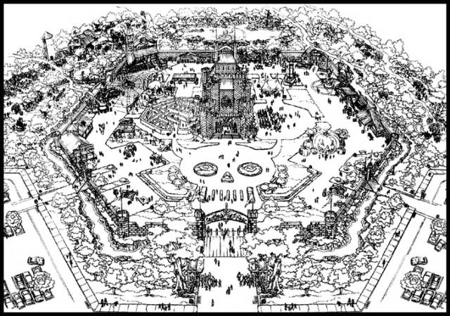
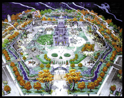
Talk about your dream projects! When Todd James of the Cutting Edge Haunt Design Firm asked us to work up a concept for a new attraction, the brief was short and succinct: An 80-acre park that could be used as a renaissance faire location most of the year, but changed up for Halloween. The only elements required by the client were a haunted castle and two hay rides. Everything else was up to us!
We started with the overall shape. Rather than the stereotypical sorceror’s pentagram, we opted for a hexagon, emphasis on the hex. The haunted castle looms over the central courtyard, with landscaping that can be made to resemble a horned skull when viewed from on high. Next to the castle is a performance stage, and on the opposite side, a topiary maze with eerie surprises lurking around the corners.
All around the interior of the crumbling walls are various vendors of gruesome edibles and bubbling potables, a scattering of themed games and tests of skill, and even a batting cave. Also on the grounds are catapults and other medieval implements that fit equally well in the Halloween and the Ren Faire worlds. And for the little ones, there’s a giant inflatable jack-o-lantern bounce house which may or may not have an exit.
Flanking the courtyard are the entrances to the two hay rides, each with its own creepy storyline and scream-worthy special effects.
As with so many other concepts, this one was ultimately unable to get off the drawing table. The company is still active, operating the award-winning Cutting Edge Haunted House in Ft. Worth, Texas. But this particular ghost still haunts us – a dream of a nightmare that never saw the light of day.
Click on any thumbnail to view larger images.
Click on the picture to view larger image.

TO RECEIVE UPDATES, CLICK HERE

PAST PROJECT
A completed job that we're still proud of

MIKE'S BLOG
A Failure to Communicate:
Where Abstract Art Has Gone Astray
The purpose of art is to communicate.
Oh, a work of art can serve other functions: it can entertain, or decorate, or simply cover a nasty stain on the wall. But to me, these are all ancillary effects. The cake beneath all that icing is communications. And that’s where so many would-be abstract expressionists are getting it wrong.
Unless otherwise indicated, all content © Mike Conrad or Radical Concepts, Inc.

LOST PROJECT
Our part was finished, then -- what?
Castle of Fear
Haunted Attraction with a
Medieval Flair
Mark Simon wrote the book on storyboards – literally! Storyboards: Motion in Art (available at www.MarkSimonBooks.com) is a fun, fact-filled compendium of everything you need to know to create and/or use storyboards, and we are proud to be among the artists whose work Mark featured in the book.
There are all kinds of storyboards, from the quick black-and-white shot-by-shot boards for film and TV to the more detailed color ones that theme park designers use to show off the sets and costumes as much as the action itself. In between are the advertising boards used by an agency to pitch the key elements of an ad campaign or commercial spot. A large percentage of our work in this last group has been done as subcontractors for Mark’s company Animatics & Storyboards, and even within this category the requirements and formats vary quite a lot.


Vol. 2 No. 1 April, 2014

ARCHIVE
Vol. 1 No. 1 (no longer available)
To view previous issues of The RadCon Rapport, click on the links below:

RECENT PROJECT
An example of what we've been working on lately

JUST FOR FUN


Frames of Reference:
Commercial Storyboards Move the Product
Cricket Wireless
Back in the days before computer graphics had really come into their own, we not only drew the boards by hand, but colored them with Pantone markers. An example of this is the series done for Cricket Wireless, whose marketing campaign was to be based on young salespersons actually living in a store-window “apartment” 24-7, allowing passersby the opportunity to interact with them via talk, text or e-mail.
Ilford
We did a more behind-the-scenes series of boards for Ilford, a paper company vying for shelf-space in Office Depot outlets. The storyboards show a young soccer mom looking at the array of paper options, and being drawn to Ilford’s unique display touting the ease with which a photo scrapbook could be assembled using their high-quality products. Subsequent boards show the progression from her initial idea, through the use of the software to compose and print the pages, to the final image of the finished book bringing a smile to her mother’s face. The background of the store display was the most time-intensive part of this project, requiring us to insert graphics of the various photo paper packages in the proper boxes on the shelves, then use Photoshop to put it all into perspective before adding the customer in a separate layer.
Brighthouse Networks
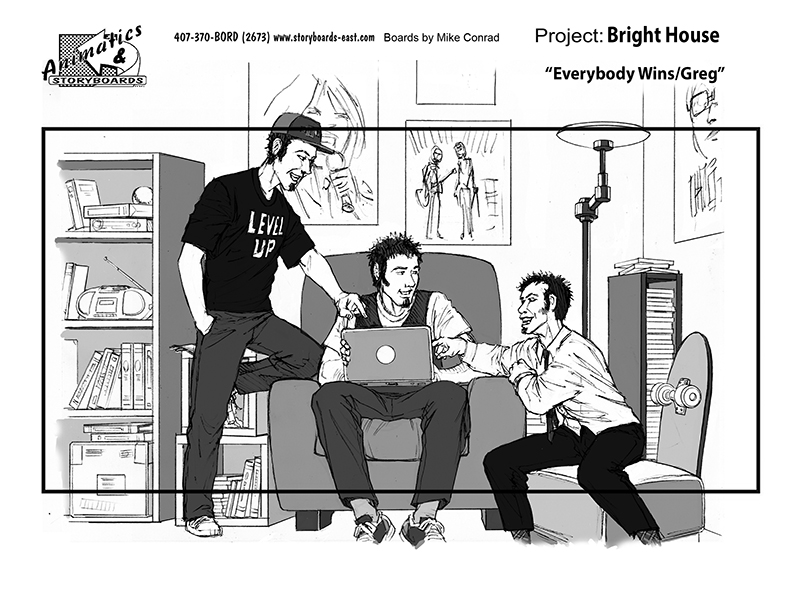
PP+K Brand Solutions created a number of commercials for Brighthouse Networks, including the memorable “Hello, Friend” campaign highlighting the softer, user-friendly side of their cable company, with gentle humor and plenty of warm smiles. A&S subcontracted us to draw several of these sequences, using gray tones for shading instead of full color.
Our approach to this kind of illustration is to rough the concept of each board out in pencil, scan it and send it out for approval and/or changes, then clean it up and color it using Photoshop. We can, of course, draw directly on the computer, using Alias Sketchbook or other drawing software, and sometimes we do it that way. But there’s just something about the texture and feel of pencil on paper that appeals to us.
Now, if someone would just start making pencils with their own “undo” buttons. . . .
Click on any thumbnail to view larger images.
Storyboard for Brighthouse Networks "Everybody Wins" campaign, which shows two sides of a customer's personality asking for specific features
Click on any thumbnail to view larger images.
Click on any thumbnail to view larger images.


Click on any thumbnail to view larger images.
"The NCO" poster . Click to view larger image. © Mike Conrad
Military Caricatures:
Commissioned and
Non-commissioned Art
These posters and more
are for sale at www.MikeConradArt.com/Military


Click on any thumbnail to view larger images.
Click on any thumbnail to view larger images.
Animal Drum Units
Each drum unit was piloted from a faux-wooden manned vehicle at the base and featured an electronic percussion set played by a live performer. The Elephant carried a full set of drums strapped to its tusks; the Camel had a pair of congas in place of its humps; the Bird had tom-toms in its shoulders, behind a head that swiveled left and right; and the Kangaroo had a set of snare drums played by a man nestled like a joey in its wicker-basket pouch. Each unit was made to look like it was constructed of various kinds of brightly-colored wood, held together with equally vibrant vines and ropes. The Bird’s feathers appeared to be layers of various leaves, while the Kangaroo was made of giant boomerangs, natural rubber bands and a coiled spring – all intended to evoke the feeling of “bounce.”
Bicycle Rickshaws
The rickshaws presented an interesting technical challenge. The idea was to have certain park guests participate by riding in the parade in shaded carriages made to look like living trees (again, of unusual hues). The bicycle part would actually just be there for steering, but the driver’s pedaling would produce motion in the animal-shaped cycle: the tiger’s head would turn, the gator’s jaws would open and close, as would the hippo’s.
But the turning radius of the hinged vehicle was too long for the sharp corners along the parade route. We had to find a way to reduce the wheel base without compromising the other design factors. After studying on it for a bit, we asked the engineers if the front wheel could be attached behind the driver and attached to the handlebars with some kind of direct linkage. Steering the thing requires a bit of additional training, as it swings like the back end of a fire truck, but it works!
The main elements of the parade were to include big animal-shaped drum units, themed bicycle rickshaws and jeep-style expedition vehicles personalized for the park’s VIP characters, Mickey, Minnie, Donald, Goofy and Rafiki, who would act as Grand Marshal. Cleverly designed animal puppets would be interspersed between these, their human operators clearly visible as part of the show. Walking and dancing alongside would be villagers in festive outfits and costume characters, such as Baloo, King Louie and Chip ‘n’ Dale, in some form of safari wear.
At first, we were tasked with conceptualizing all the visual elements, and so we whipped out rough concept sketches, refined them with input from the other players, then put some color to them and compiled a proposed line-up to see how the pieces might fit together. At this point, an executive decision was made to split the conceptual work between three main parties. Disney’s Matt Davison, Disney Creative’s in-house costume designer, took the reins on all the apparel, producing some truly wonderful looks that went far beyond our first-plush attempts. World-renowned puppet master Michael Curry applied his tremendous expertise to the walking puppets, creating amazing, stylized animal forms full of delights and surprises.
Radical Concepts was freed up to concentrate on the motorized vehicles (and the logo design), which was quite enough to keep us busy. The number and mix of these was finalized at five character jeeps, four drum units, three bicycle rickshaws and a partridge in a pear tree (actually, that was a later addition, part of the overlay we did to dress the parade up for the holiday season).