victory with a parody of Playboy magazine we called Grayboy (at West Point, everything is gray – the uniforms, the buildings, even the squirrels), I came out on stage, looking like Hef in my cadet-issue bathrobe and a pair of cardboard bunny ears, and told the newbies how much fun it would be to join The Pointer staff, or at least to sign up for a subscription to the magazine. And while you’re at it, you can also order a copy of our special comic book. Our reps are handing out applications and order forms as we speak.
Afterward, I got chewed out by a colonel for wearing that undignified costume, especially the ears, but that didn’t matter to me at all because I had just met my quota, and Peter Parsec was about to ride again!
I did learn a valuable lesson, though, and the following year I exercised considerably more restraint. Even though I was now the Editor-in-Chief, I knew it would be best to limit each episode to four pages. I had plotted another story arc to run through the entire year, but it was going to be done in smaller pieces. I had also learned a thing or two about comic book art, such as the use of dot screens for shading, and employed my new techniques with gleeful abandon.
One thing I did not abandon, however, was the use of little sight gags. Drawing inspiration from Mort Drucker’s parodies in Mad magazine, I strove to fill every nook and cranny with toss-away jokes and incongruous details – and had gained a bit of a reputation for doing so. My readers delighted in watching for them the way today’s kids search a video game for its hidden Easter eggs.
And the puns, of course. Sometimes I’d go through a whole page of story just to set up what I thought was a particularly clever play on words. Some may argue to the contrary, but that was too bad; this was my story, and I was sticking to it.

A theme park based on stories of the Bible is not exactly an unheard-of project (Orlando’s Holy Landcomes to mind), but one that emphasizes the entertainment value of scripture is. Mark Simon, of Animatics & Storyboards, is one of my favorite clients, often bringing me on board to do advertising storyboards and such. But this time, he had a different kind of fish on the hook: a businessman in Louisiana who was looking to develop a concept he called Bible Alive!
Before he could do that, of course, he would need some visuals to present to prospective clients, city councilmen and the local press. That’s where we came in. Mark went over the creative brief with me and another artist (the great Alex Saviuk) who would work on a different aspect of the attraction. We brainstormed a bit, looking for creative ways to accomplish what the client had in mind, and then I got to work roughing out the concept.

TO RECEIVE UPDATES, CLICK HERE

PAST PROJECT
A completed job that we're still proud of

MIKE'S BLOG
Good/Bad/Ugly:
Fictional Sets and Architecture
Heroes have their headquarters, villains their secret lairs, and adventurers stumble into lost cities in the middle of steamy jungles. Even E.T. found a place to call home, although he didn’t really live there. Whether it’s a true sanctum or just a way station along the road to a bigger and more spectacular locale, a well-designed fictional setting is often as much a character in the story as the people in it. The place has its own personality, which should play off the style and mindset of its primary inhabitant; when it doesn’t, the effect can be jarring. Who, for instance, would buy into a Bat Cave decorated with Andy Warhol prints?
Unless otherwise indicated, all content © Mike Conrad or Radical Concepts, Inc.

LOST PROJECT
Our part was finished, then -- what?
Vol. 2 No. 2 July, 2014

ARCHIVE
Vol. 1 No. 1 (no longer available)
To view previous issues of The RadCon Rapport, click on the links below:


RECENT PROJECT
An example of what we've been working on lately

JUST FOR FUN

, which was later titled \"Against Regulus\"
© Mike Conrad")


Click on any thumbnail to view a larger image.
Peter Parsec,
Space Cadet
The Moons of Satire
Though it probably doesn’t appear in Joseph Campbell’s pantheon of legendary archetypes, the Space Cadet was a popular literary trope long before the dawn of the Space Age. The Tom Corbett adventure series on old-time radio is a well-known example, as are the novels by Robert Heinlein and E.E. “Doc” Smith. And let’s not forget Captain Kirk’s alma mater in Star Trek.
In the 1960s and 70s, the term was a humorous way to describe a person whose mental hold on reality was slipping, often due to the excessive use of drugs. The epithet was still in use when I first reported to the United States Military Academy in 1976, although in the drug-free environment of West Point, the stoner angle wasn’t even part of the equation.
A big fan of science fiction and comic books, I found a creative outlet for my burgeoning career as an artist and writer in the cadet-produced monthly magazine The Pointer. Like the better-known Harvard Lampoon, this publication had been tickling the student body for many, many years. I was thrilled to be a part of such a venerable tradition, eventually rising to the position of Editor-in-Chief. This gave me the opportunity to hone my skills at drawing, painting and writing in a variety of styles, for features both serious and satirical.
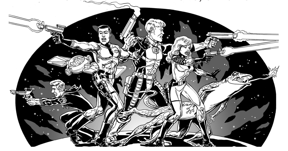
The most enduring of my creations was a long-running segment titled "The Adventures of Peter Parsec, Space Cadet." In four pages of black-and-white comic book panels, Pete and his pals would head off on ridiculous quests to battle such villains as Calculus and his sidekick the Slipstick Surfer, cracking jokes and acting like adolescents all along the way.
As you could probably guess, the character’s name was inspired by Spider-man’s alter ego, Peter Parker, with a science-fiction twist: a parsec is a measure of interstellar distance, equal to about 3.26 light years. Pete is a cadet at the United Space Military Academy, orbiting the earth at Highest Point in the late 21st Century. Although he’s in the top 15% of his class in academic standing, his lowly rank of Cadet Sergeant implies he is a bit of a slacker. Until there’s a crisis, that is. When an evil force threatens the universe, or the planet – or just his music collection – Pete is the first one to leap into action.
But he doesn’t go there alone.
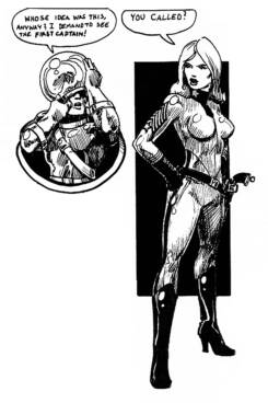
Mine was the first class at USMA to include women, a controversial change in policy that garnered a vehement reaction from many members of the Long Gray Line, as it threatened the identity of an institution charged with turning boys into men. I wanted to poke these guys in the eye, so when I introduced the female lead in my little story, I made her the highest-ranking cadet in the Corps. First Captain Carrie Sabres had more stripes than any man in the brigade and a name that was actually a vocal command used on the parade field.
I expected a backlash from the macho upperclassmen, given their attitude toward my female classmates, but Carrie surprised me by becoming an instant hit. I probably should have expected it, considering I had drawn her as a hot blonde in a skintight uniform (to be fair, all the space cadet uniforms were skintight, but nobody ever commented on the athletic build of the male characters).
Both the Comic and the CD
are for sale at www.MikeConradArt.com/Comics
Vegas Stripped
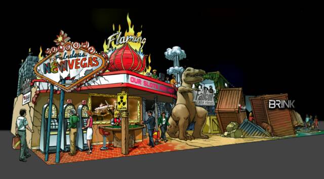
For Fallout New Vegas, a bit of roadside kitsch would help convey the faded glory of the fabled Strip, so we decided to recreate Dinky the Dinosaur, but in lieu of his giant thermometer, we opted to have him hold a sign in his undersized hands. Just around the corner would be the much bigger “Welcome to Fabulous Las Vegas” sign that, as in the game itself, would substitute “New Vegas” for the original name. In between these icons would be the façade of the dilapidated Flamingo Hotel and Casino, complete with slot machines and a blackjack table.
Rage within the Machine
Down a narrow corridor, the broken landscape would continue with the clown-faced entry to a mini-theater, where guests could immerse themselves in an adrenaline-spiking preview of Rage.
Party Animals
Disney’s Animal Kingdom
Opening Press Event
The story according to Mike:
It was the biggest birthday party I’d ever had, but it wasn’t exactly a surprise. In fact, it had taken me months to put it together – me and a whole lot of other hard-working people.
April 21st, 1998, was the date set for the press event that would be the coming-out party for Disney’s Animal Kingdom, and it was going to be huge. Hundreds of journalists from all over the world had been invited to a sneak peak at Walt Disney World’s newest theme park, and the Mouse was going to put on a distinctive party at each of several locations simultaneously.
A certain amount of preliminary work had already been done – enough to greenlight the basic concepts – but there was still an enormous series of challenges ahead of us. We gathered in one of the big conference rooms for a series of brainstorming sessions with Joe Rohde, the King of the Animal Kingdom designers. As is the usual case for Disney projects, the room was chock-full of designers, technical directors, show producers, music directors, costumers and even representatives from the catering side of the operation. Joe presented his overview, and we were all invited to ask questions, point out possible stumbling blocks, and contribute whatever thoughts might be of some help. It was a fun, creative atmosphere, with ideas crackling through the air and plenty of give and take.
When it came time to divide up the job into the various parties, I was assigned to handle the design and art direction of the one at Disney’s Wide World of Sports. This would encompass the main entry, the field house, and all the open space outside it, but not the baseball stadium itself (where the night’s attraction would be a concert featuring Stevie Wonder, and another designer was tapped to take it on).
Click on any thumbnail to view a larger image.
Click on any thumbnail to view a larger image.
Bible Alive!
A Modern Treatment for some Ancient Stories
I worked on it wherever I could find some spare time: in the dayroom at Airborne School at Ft. Benning, on a tank gunnery range in Germany while attached to an armored cavalry squadron, and at home in Colorado during a month of summer leave. This was going to be epic!
But the Editor was not about to devote eight pages of each issue to a single feature, no matter how popular it might be. That would have constituted a fifth of the magazine! I was crestfallen – all that work, and nobody would ever see it.
Then I had an idea: why not publish it separately? Instead of serializing it throughout the year, we could put it all together, slap a cover on it, and sell it as one long comic book (a format that would someday be known as the graphic novel). There was a precedent, of sorts, in a compilation of satirical diary entries that The Pointer had published years ago in hardbound form. The Officer in Charge of the magazine made me a deal: if I could sell half the print run of 2000 copies in advance, the project would get a green light.
I jumped at the chance, and quickly drew up the covers, then started taking orders from my fellow cadets through our Pointer sales reps. The biggest boost came when we participated in an assembly to orient the incoming plebes to the Academy’s various extracurricular clubs. Having just scored another huge
The series ran in every issue of the first year, and I was thus encouraged to crank out some more. So over the summer, I put together an even more ambitious story arc. This time, instead of the usual two-part tales of four pages a segment, I concocted a single storyline that would run all year long in eight-page chapters.
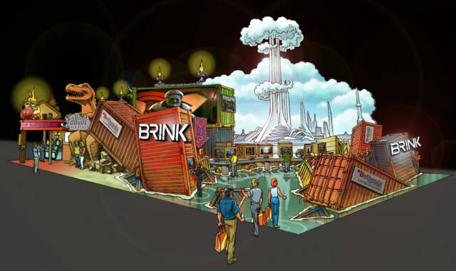
Video game giant Bethesda Softworks wanted to make a big splash. Their plan was to debut four of their hottest new games at the Electronic Entertainment Expo (commonly referred to as E3) in Los Angeles, with a two-story island booth that would feature visual icons of each games to draw in the gamers and consoles for them to try the games out.
Leo English, a big wheel at event planner Sparks Entertainment, knew that Radical Concepts was the company to handle the design. We had worked with Leo on some futuristic projects when he was at Piper Productions, so when Piper was bought out by Sparks, Leo brought us along in his Rolodex.
Sparks provided a layout of the booth space, including a 3-D computer rendering that showed all the gaming stations and a bare-bones delineation of the main areas. We worked with the Bethesda folks to decide which icons would be used to anchor each gaming zone, choosing those that would have the most visual impact in the limited volume available.
Winning the Game Show
Bethesda's Booth Is a Big Draw at E3 Gaming Expo
A Foretaste of Four Games
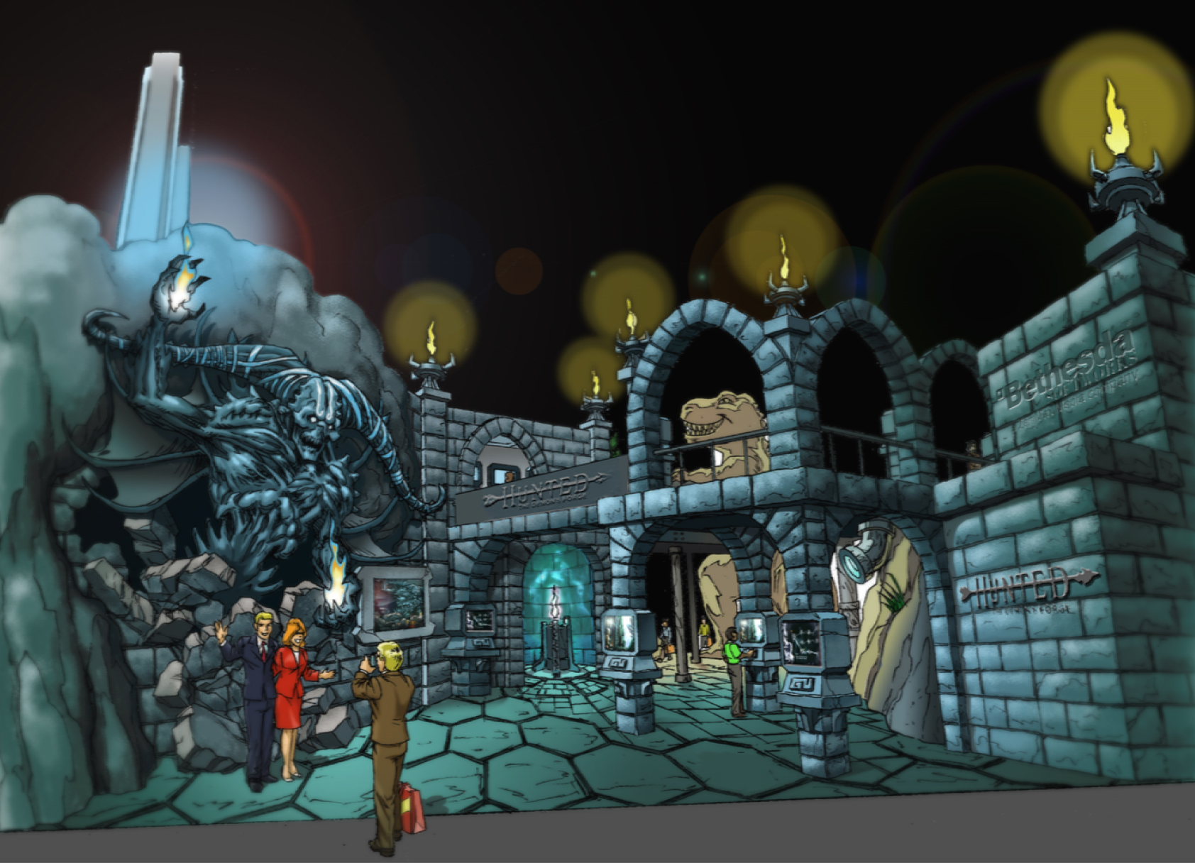
The games were all of the fantasy/science fiction genre, with high-end graphics and all the creative storytelling and imagery that are Bethesda's hallmarks.Fallout New Vegas is a post-apocalyptic adventure set in what’s left of Sin City after a nuclear war has devastated the landscape. Rage is also set in a post-apocalyptic world, this one following the impact of a huge asteroid that shattered society into small bands of humans and mutants, into which comes a survivor from an underground cryogenic Ark. There’s a different kind of Ark in Brink, this one a formerly utopian island-city that floats above a flooded earth, where those who are not able to crowd into the Ark must eke out an existence in cramped quarters made from rusty shipping containers and battle the other factions for survival. Departing from the disaster theme is Hunted: The Demon’s Forge, a dark fantasy full of elves, demons and mystical spirits that involves a hard-fought quest to obtain a mysterious artifact.
On the Brink
The tallest structure, and the one we felt would be the biggest draw, was the Ark from Brink. Its pristine, white curves would soar like a gleaming rocket ship above the forced perspective of the flood waters, an aloof ivory tower that would stand in stark contrast to the corroded, half-sunken shipping containers littering the foreground. An animated projection of wavelets would give the illusion that the guests were standing on the surface of the sea; more sunken containers were to be visible in the virtual depths below their feet.
The Hunted Games
Venturing further down that bleak path, guests would find themselves on the far side of the booth space, surrounded by torch-lit walls and stone arches from the epic quest Hunted. In one alcove, a special light effect brings a disembodied spirit to life, while nearby a gigantic demon lunges through the brickwork to pose for photos. Guests try their hands at the game by way of several consoles built into the square pillars as a looped trailer plays on a video screen set into one of the walls.
Gamers' End
Seldom does an initial concept survive intact through the entire pricing, approval, fabrication and installation process. This project was no exception. The end result was considerably slimmed down with regard to details, effects and even the icons themselves. Gone was the big clown-face entry to Rage, as well as the giant demon from Hunted (replaced by life-size maquettes of the game’s two main characters) and the whole Vegas casino. Even so, the reviews were overwhelmingly favorable, with gamers and gaming industry insiders citing the Bethesda display as one of the best the expo had to offer.

Concept Art
Click on any thumbnail to view a larger image
How It All Turned Out
Click on any thumbnail to view a larger image


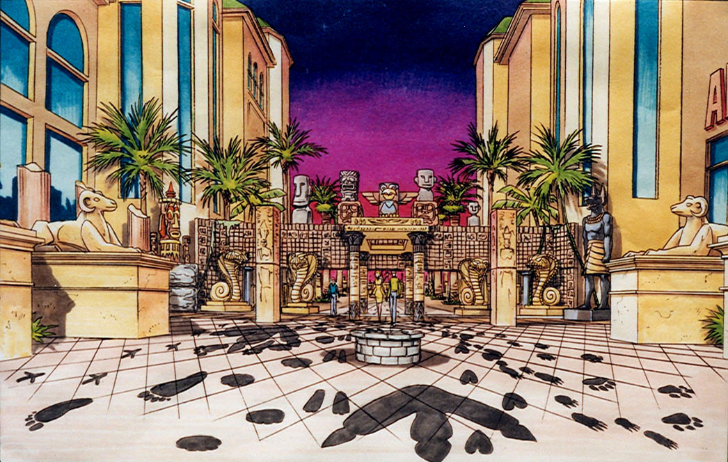
Enter Through Atlantis
The main entry demanded a really big visual statement. Fortunately, considering the shortage of rentable animal sculptures, the entire outside promenade was getting a totally different approach. The courtyard and walkways had been divided into seven different zones, each featuring regional cuisine from a different part of the world, presented by a different resort at Walt Disney World. For example, the Magic Kingdom was to provide a selection of African and Caribbean foods, while Fort Wilderness was bringing Western and Asian.
This worldwide assortment of cultures suggested a viable theme for the main entry feature: Atlantis. According to one version of this legend, the Atlantean civilization was the ancestor to all other ancient cultures, and so it would be a place where all the signature architectures of classical times would rub shoulders with one another. It was a simple matter to pick out big sculptures of Egyptian columns, Assyrian sphinxes, Polynesian Tikis, Easter Island Moai, Mayan stone walls and so on, and combine them into a fairly cohesive tribute to multiculturalism. And it would look pretty cool, to boot.
We still needed to make some reference to the animals, though, and somebody suggested laying down tracks of footprints along the walkway. So I did a little research, and drew up a selection of animal track (complete with their relative sizes and lengths of stride) that could be cut out of black vinyl and placed directly on the concrete. The original idea was to have them leading into the party as the guests were arriving, then turn them around while the event was under way so that they would lead back out to the parking lot after it was all over. But that turned out to be way too labor-intensive, so we just had them pointing in.
Click on any thumbnail to view a larger image.
The Watering Hole
The interior of the building was called the Watering Hole. It was to be divided into eight stations, the theme of each tied to a particular animal: Zebra, Lion, Giraffe, Elephant, Monkey, Fish, Dinosaur and Dragon. The only one that anybody had given much thought to already was Zebra, which was originally imagined to be a rather abstract representation of alternating black and white. That was fine as far as it went, but the other areas would clearly need a different approach, as the signifying characteristic of a lion would not be so easily reduced to a pattern of colors. I realized early on that for these themes to be effective, the animals themselves would have to be present, so I began searching all the prop and set rental houses in the area for, among other things, every lion, dragon and dinosaur I could lay my hands on.
It was a pretty mixed bag. Whereas all the dinosaurs had been made by the same company, and thus they were all of the same style and quality, the same could not be said for the lions. Those of Company A were fairly realistic, but the ones offered by Company B were less detailed, almost cartoony. Unfortunately, the best I could do to offset that glaring inconsistency would be to separate the two styles as much as possible within the set, and even allow a tiger to round out the gang of big cats.
For each area, I devised what I thought was a reasonably clever solution to the challenges of tying it all together thematically into an attractive whole, augmenting the rental props and set pieces with swaths of fabric and plenty of foliage.
Click on any thumbnail to view a larger image.
The alternating black and white drapes of Zebra had already been suggested; I simply added a couple of the striped animals and concentrated on other areas.
To evoke the undersea environment of Fish, I used a piece of blue coral (sculpted foam, of course) and lots of colorful fish, seahorses and starfish scattered about. Rising up from the ocean floor were columns of balloons that were meant to suggest streams of bubbles, and other sculpted corals decorated the tables.
The original idea for Giraffe was to set everything up high – barstools, tables, cooking counters – but the safety folks intervened, and we had to settle for just a pair of life size giraffe sculptures and some tall grass around the tables. So much for lofty ideas!
For Lion, I seized upon the King of the Jungle trope and built a royal court out of reed mats and tiki torches, with red drapes that had been slashed as if the cats had been clawing at the curtains. On the central dais was a gilt-edged throne flanked by two of the big cats (one apparently an emissary of the Tiger nation). The entry was a rather spectacular sculpture of a black panther’s gaping maw – actually, the entrance to the treasure cave from Disney’s Aladdin.
Elephant was a bit of a challenge in that there were only three available, two of which were juveniles. So I opted to broaden the category to incorporate all pachyderms (which means “thick skin” in case you were curious). This allowed me to have the head of a rhinoceros poking through the foliage, thus restoring the dignity that such majestic creatures deserve. As for the table treatment, I got hold of some big strips of gray paper and had people crumple them up before flattening them back out to emulate the animals’ wrinkled hides.
As mentioned before, I found all the Dinosaurs in one shop, so it was a simple matter to place a couple of triceratops, a brachiosaurus and the head of a T-rex among the jungle plants to tell a story as old as time itself.
Monkey was made up of trees and a decorative arch, with a blue spider monkey swinging from its apex. I fudged my primates a little, relying on some of the great apes (gibbons and chimps, in this case) to fill out the troop, even though they are only distant cousins of monkeys. There were probably some bunches of bananas in there somewhere, too.
And finally, there be Dragons. As you may know, the Animal Kingdom was originally supposed to include an area of mythical creatures, so this was not as gratuitous as you might think. There were all sorts of examples available to use in the Dragon area; unfortunately, they were of all sorts. But I managed to find a way to use them that wasn’t too ridiculous. Using some star-patterned fabric that spoke to the creatures’ magical nature, I walled off a chamber full of treasure, and placed one of two heads of the medieval fantasy species there to guard it, his brother keeping watch from the bushes outside. A golden Chinese dragon preened among the tables while high overhead, a red sky dragon flew among the glittering stars and crescent moons. Unfortunately, none of these was a fire-breather, which made them all but useless when it came to the cooking.
Click on any thumbnail to view a larger image.
The World Village
The courtyard and walkways outside the field house were slated to be transformed into a bazaar of some 150 individual cooking and sampling stations showcasing the broad variety of foods from around the world.
The food stations were all supposed to be decorated, too, and themed to match the ethnicity of the food being served. I did some research with fabric suppliers and prop rental shops again, and came up with the best plan I could work out. When I presented it to the group, however, the problem suddenly became far more difficult than I had ever imagined. I stated, almost off-handedly, that the tables would be skirted in a variety of colored tablecloths, as was the normal practice just about everywhere.
The guy in charge of organizing the catering among all the resorts immediately smashed that idea to the ground, claiming that table skirting was “20th Century” and we were supposed to be doing something more “21st Century,” where the preparation of the food was all part of the show. I asked if he meant he wanted people to see the propane canisters and the legs of the cooks under the tables, but that wasn’t what he was after.
It took a lot of back-and-forth between the two of us before I finally got him to clarify that he still wanted to hide things under the table, but just with some means other than table cloths. Which would have been just fine with me, except that he’d waited until practically the day before installation to tell me.
So now I had to scramble to find enough “other stuff” to fill in the empty spaces. I went back to the rental companies and snagged every barrel, hay bale and cart wheel they had, and sent people (myself included) out to all the home improvement stores to buy every scrap of burlap and every reed mat in the Orlando area so we could cover the openings with something that did not clash too much with the primitive props and native fabrics that the caterers were bringing to the table. Somehow, we got it all covered, and everyone was happy.
We were also extremely tired. The various teams worked around the clock to get everything set up in one day, sprinting through the final hours in a desperate effort to finish before the guest journalists and travel agents arrived. Somehow, we pulled it off.
The guests appeared to be enjoying the scenery almost as much as they did the delicious food, and we allowed ourselves to relax for the first time in several days. We sampled the various delicacies ourselves, and then used our access passes to gain entry to the control room at the stadium to watch Stevie Wonder perform. I tried to dance, it being my birthday and all, but after all that time treading on concrete, my feet were just killing me. At least I didn’t have to be there all night while they struck the set.


")


We based the overall architecture on an archaeo-logical model of Old Jerusalem, complete with Solomon’s Temple. The walled city was a natural for the contained environment of a themed attraction, although of course we added some more modern touches, such as outdoor cafes, Christian-themed fountains and the ubiquitous fish motif applied to the stonework of the plaza.
A particularly delightful feature of the complex was the Garden of Eden, a lush botanical environment under a glass dome, complete with waterfalls, wading pools, colorful birds and some “outdoor” chapels where weddings or other services might take place.
My favorite contribution to this was in the structure of the dome itself, which would not just be the usual straight-lined geodesic struts, but instead gracefully curved, intertwining tree branches that climbed to a stylized sun motif at the top.
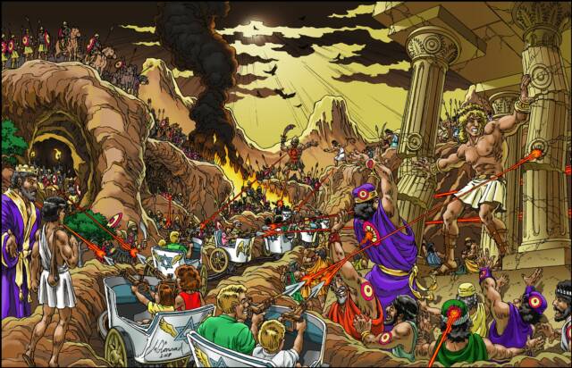
We had a much harder time with the David and Goliath ride. This was supposed to be an interactive dark ride, along the lines of Universal’s Men in Black: Alien Attack, in which guests shoot lasers at alien targets as they ride past them on a track. Working laser weapons into a biblical scenario without invoking the so-called Ancient Aliens hypothesis took a bit of doing, but we finally decided to go with magical spears mounted on a series of chariots and just let people make their own rationalizations. Just having David fight Goliath would be a pretty short ride, however, so we expanded it to cover more of the conflict with the Philistines, including Samson’s destruction of the temple. The laser targets look a bit out of place, but they had to be obvious or people would not know where to aim their spears.
We were really looking forward to fleshing out these concepts in the next phase but, like the Ark of the Covenant, the client mysteriously vanished, never to be heard from again. Fortunately for us, Mark Simon is a scrupulously honest businessman, and he paid us for our part in the project.
© Animatics & Storyboards
Click on any thumbnail to view a larger image.


My senior year brought a new dimension to The Pointer, with the ability to do a total of four pages in full color. I resisted the temptation to use it on Peter Parsec until the very end. In a final wrap-up of the three-year saga, Pete and Carrie finally graduate and are accidentally – but irrevocably – married by an alien computer. Unfortunately, the issue did not come back from the printer until Graduation Day, and in the hectic scramble to head out on leave, most of my classmates never received their copies.
For many years, my classmates urged me to do a follow-up. I toyed with the idea on and off, but was always too busy to get it done. Then finally, seeing yet another class reunion coming up, I decided it was time. There were other factors in favor of the project: computer graphics had made desktop publishing a much better alternative, and I found a company who would print up as many copies as I needed on demand, which meant I wouldn’t have to risk my life savings on a huge inventory.
I decided to do it as a “next generation” story. Pete and Carrie would be in there, to be sure, but the primary focus would be on Peter Parsec, Jr. and his Co-First Captain, Rusty Barrels (who just happened to be another attractive young woman, albeit this time a redhead). Rounding out the cast were Cy Borg, whose artificial arm was as versatile as a Swiss Army knife, and Alienne Gray, a native of the star Tau Ceti who surfed the air on a miniature flying saucer. They were supervised, to some extent, by their martial arts instructor, a giant panda by the name of Yin Yang (this was a year or two before Kung Fu Panda hit the theaters). The gang had to venture to the core of the galaxy to see what was causing a series of time distortions to ripple out, creating alternate universes and generally interfering with good order and discipline.
The original script was going to be an 80-page graphic novel, but time was getting short (and unlike the characters in the book, the closest thing to a time machine I had access to was my wristwatch), so I trimmed it down to 20 pages. But with the advent of modern desktop computers, I was able to do a cleaner, more professional job of drawing, shading and lettering the pages. The result is still full of puns and sight gags, but now they are much easier on the eyes.
Since so many of my fellow grads had not been able to read the final chapter of the original series, I decided to transfer the entire collection to PDF format and package it as the Classic Adventures on a compact disc, with a couple of special features thrown in.
P.S. One of Pete's fans has actually set up a Facebook page in his honor. In the future, of course, it will probably be called Spacebook., but for the time being, you can find it at https://www.facebook.com/peter.parsec?fref=ts
© Disney
© Mike Conrad
Cast of the Classic Adventures: Buster Crab, Peter Parsec, Monte Zoomie, Carrie Sabres and Ezekiel, the alien Frog