The logo concept we preferred (although this is just a rough). © Planet Hollywood

TO RECEIVE UPDATES, CLICK HERE

PAST PROJECTS
Completed jobs that we're still proud of

MIKE'S BLOG
Good/Bad/Ugly:
Fictional Personal Weapons
Man is a pretty defenseless creature; were it not for his big brain, he wouldn’t stand a chance out in the wild. Well maybe in Tahiti (I hear it’s a magical place), but not so much in the more hostile rest of the world.
But a big brain he has, and sometimes he’s smart enough to put it to good use. Man has been making weapons since he was knee-high to a Neandertal. At first, though, he was probably more into shopping for instruments of mass destruction than creating them – as in, “Hmm, that rhino leg bone would be just the thing for crushing a cave bear’s skull!” – but it wasn’t long before he got the idea of modifying these hard and sharp things to use them against the more fragile parts of his fellow hominids. The survivors caught on pretty quickly, too, and before they knew it, our ancestors found themselves in a full-fledged arms race.
Unless otherwise indicated, all content © Mike Conrad or Radical Concepts, Inc.

LOST PROJECT
Our part was finished, then -- what?
Vol. 4 No. 1 March, 2016

ARCHIVE
Vol. 1 No. 1 (no longer available)
To view previous issues of The RadCon Rapport, click on the links below:

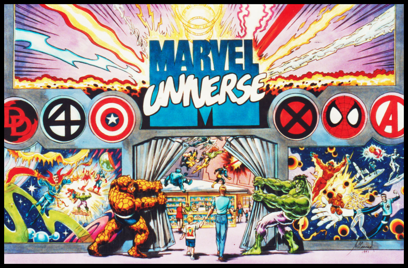
Conceived as a broad metallic wall with windows full of colorful graphics lit from behind, this appropriately bold architectural statement would have brawny sculptures of the Hulk and the Thing working together to pry apart the massive security doors, and depictions of Marvel characters in their trademark cosmic environments.
Overhead, the store’s nameplate radiates a variety of the power beams and energy blasts that illuminate the pages of these action-packed adventures. Through the breached doorway, one can see the display shelves, which seem to be a part of the X-men’s training area, the Danger Room.
Nowadays, there are plenty of video games based on super heroes, and cosplay (making and wearing costumes of one's favorite characters) has become an industry in itself at the various sci-fi, fantasy and gaming conventions around the world.
RECENT PROJECTS
Examples of what we've been working on lately
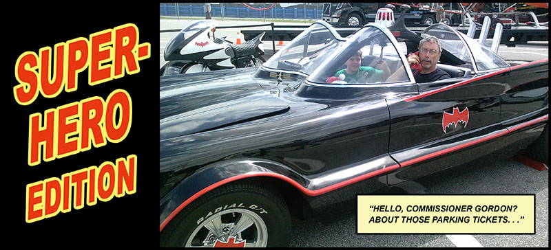
Batman Forever
The Dark Knight
Sees the Light
in a Single Day
Click on any thumbnail to view a larger image.
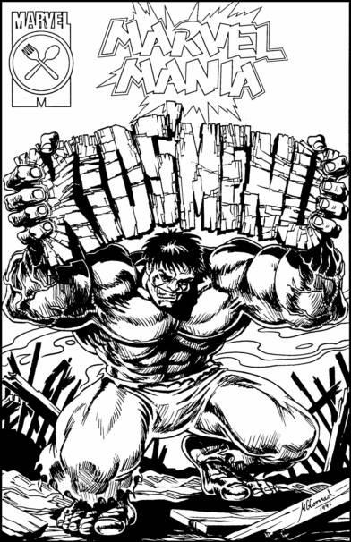
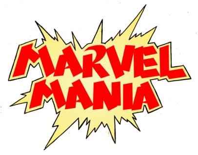
MarvelMania
Outlandish Menus for Extraordinary Venues
Field Artillery is one of the most powerful of the combat arms, able to throw down awesome destruction from far away. Unlike Infantry and Armor, though, the FA found a place for women within its ranks.
Therefore, this was a natural choice for a male/female team working in tandem. The primary cannon-cocker is the burly man, but the woman – whose role is that of a forward observer, helping to refine the targeting of each salvo – wears a set of high-tech goggles, indicating her enhanced vision.
"Answering Machine"
Army of Super-Heroes
Posters Show the Alter Egos of Today's Soldiers
As reported in a previous edition of this newsletter (Vol. 2, Issue No. 1), I have drawn a lot of military posters, some of which are still on sale through my website (www.MikeConradArt.com).
The most successful of these was a humorous take on the Military Intelligence branch, so it seemed that branch-specific posters were the way to go. Then, while I was working out the details on a similar take on the Signal Corps (where I’d spent my eight years of service), it dawned on me that the Army’s recruiting efforts were oriented toward the same market demographic as comic books – young men (and, to a lesser extent, young women) in search of larger-than-life adventures seasoned with a dash of heroism. So why not combine the two and create a series of posters portraying each branch of the Army as a super-hero? Comic book covers are designed to lure the reader in and get him involved in the story -- pretty much the same idea behind recruiting posters.
And that was the origin of Super Troops.
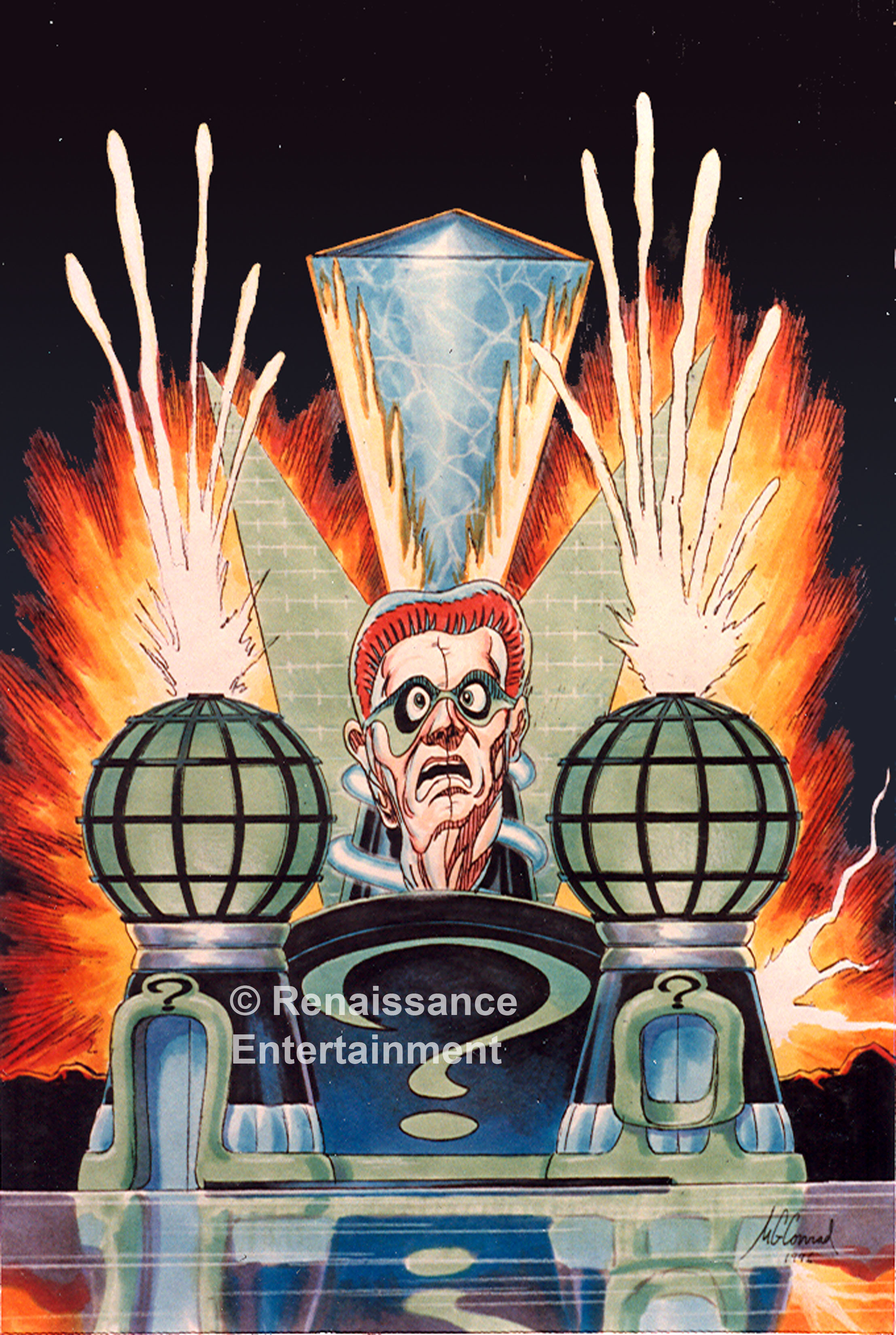
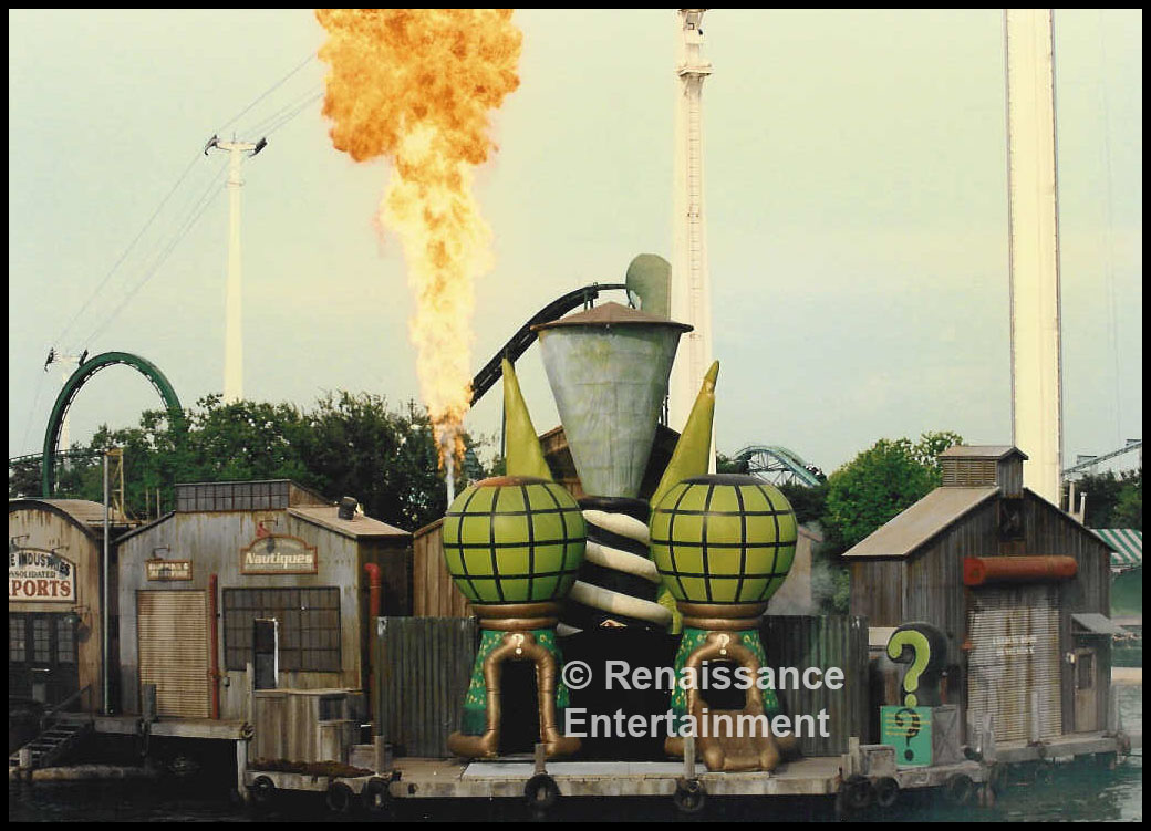
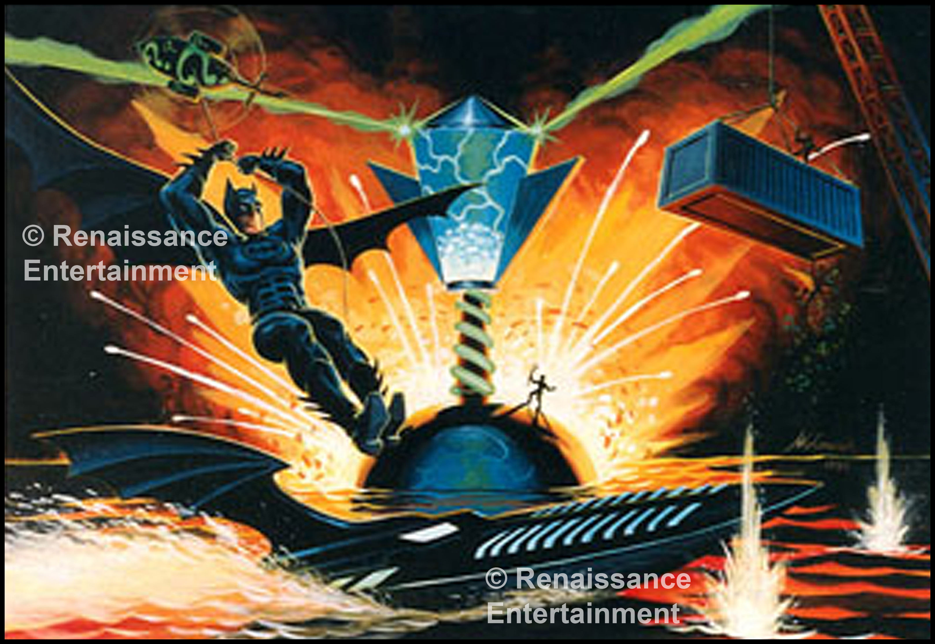
It’s always an honor to work on a project with such an iconic character as Batman, whose long history spans some seven decades in the forefront of popular culture. So when Jon Binkowski of Renaissance Entertainment called me one Saturday morning with a request for a dynamic painting to depict their proposed lagoon action show based on the third movie of the franchise that was initiated by Tim Burton, I jumped at the chance.
Concept painting for the Batman Forever stunt show at Six Flags, featuring the Riddler and his giant Brain Drainer. © Renaissance Entertainment
Behind the Howl-O-Scenes
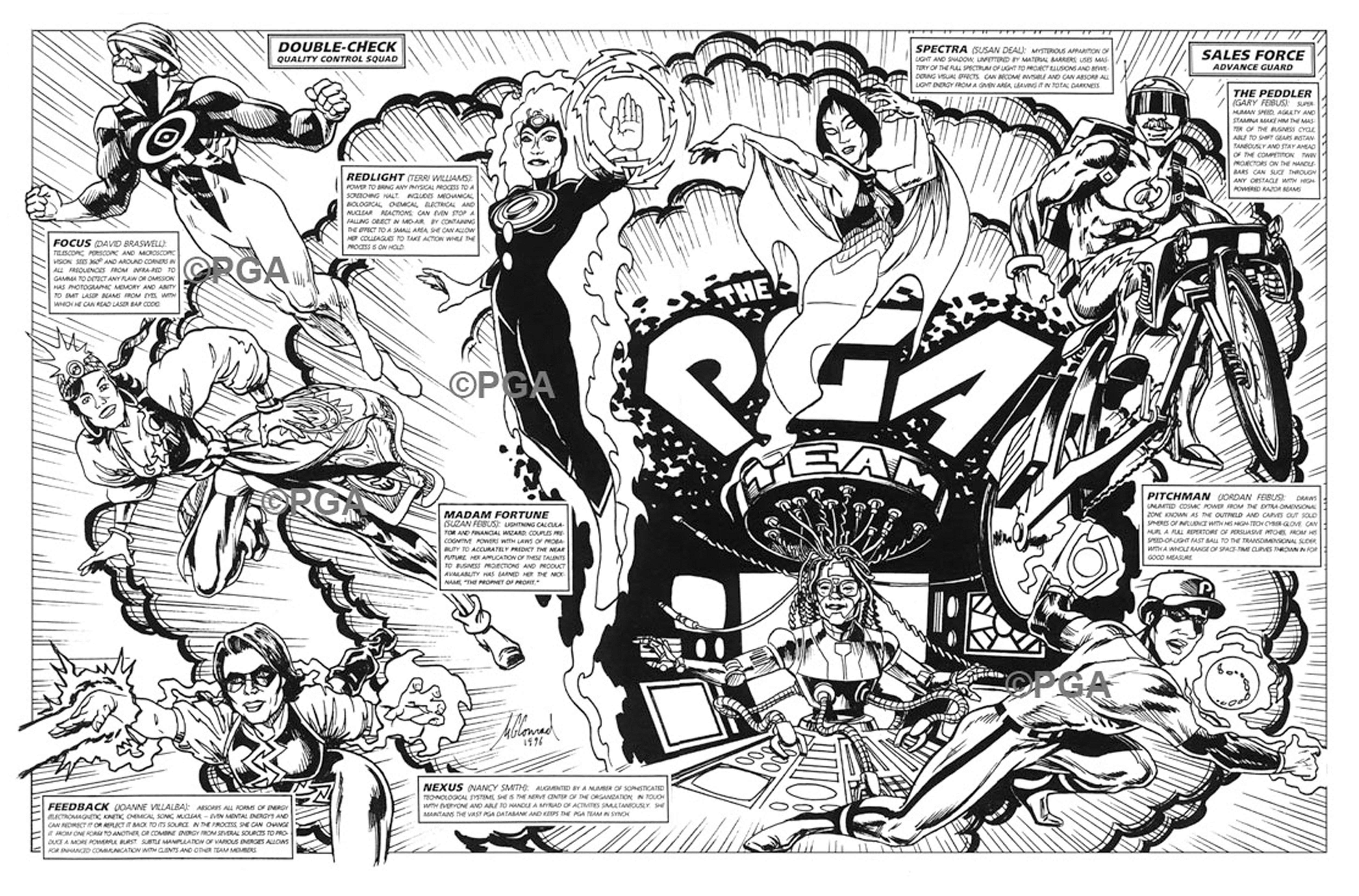
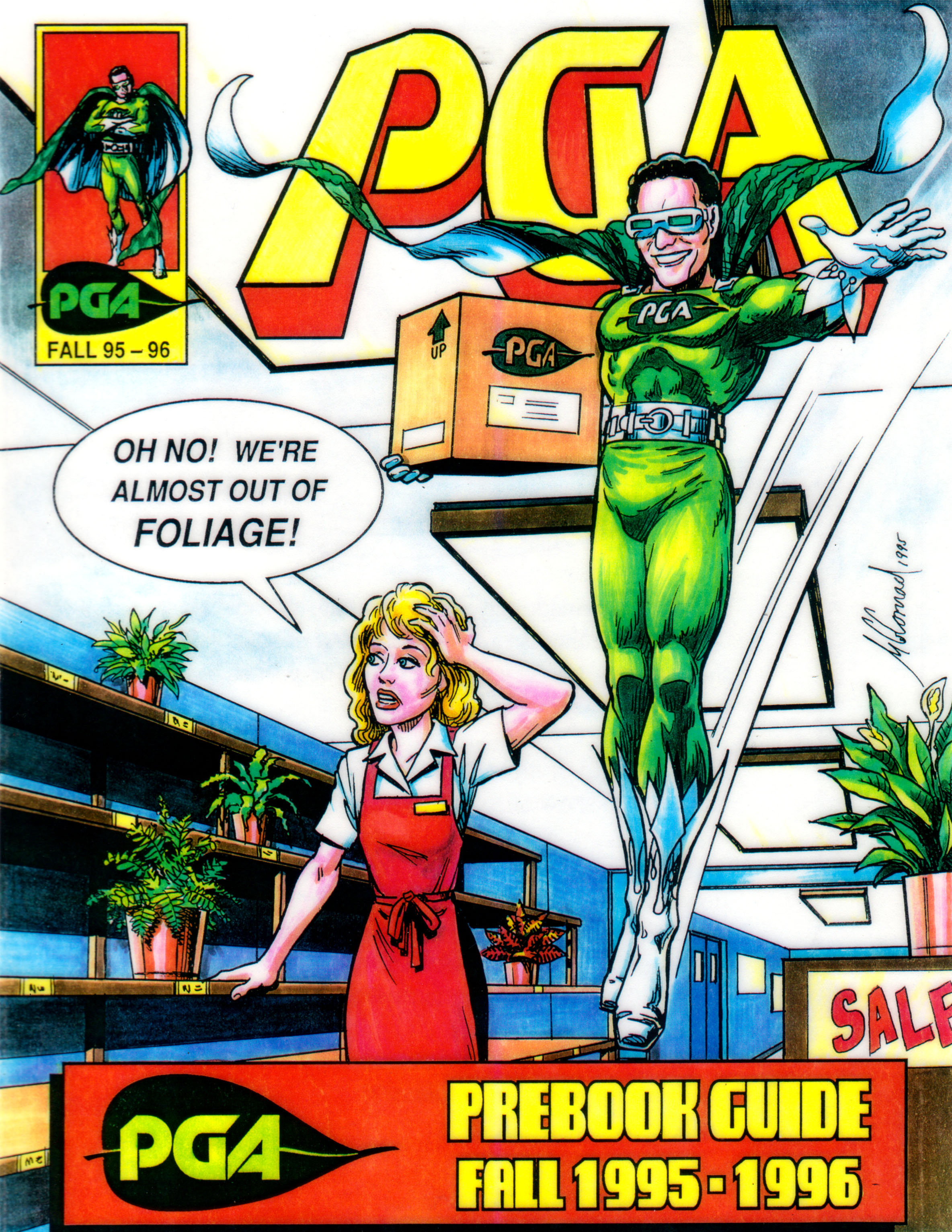
Above: The comic book-style cover of the annual catalogue, with the company' represented as a super-hero. Below: A 2-page spread inside the catalogue showing the staff as a super-hero team. © PGA

Way back at the end of the last century, there was a restaurant at Universal Studios Hollywood called MarvelMania, where families could enjoy a nice meal surrounded by bold, colorful comic-book inspired artwork and live costumed characters. Robert Earl began looking into building another one at Universal Orlando in hopes of repeating his success with the Planet Hollywood franchise that had recently opened at Disney World.
I don’t know who was involved in the actual design of the attraction itself, but I was offered a bite of the menu design, and I took it. Art Director Mike Havekotte, with whom I had worked when he was on staff at Orlando magazine, asked me to help him flesh out some menu designs. Being a huge fan of Marvel, I was happy to draw up some concepts based on his layouts. Then, as often happens in this business, the project lapsed for a while and Mike and I moved on to other gigs.
Not too long after that, Gary Kerns got in touch with me. He was working for Earl to develop the attraction, and wanted me to do some more work on the menu and ancillary items. It turned out that the creative folks at Marvel wanted their menu to look more like a comic book, and had sent along some designs that they were planning to do thermselves.
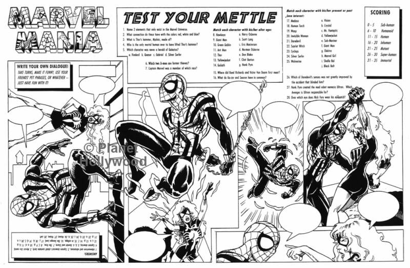
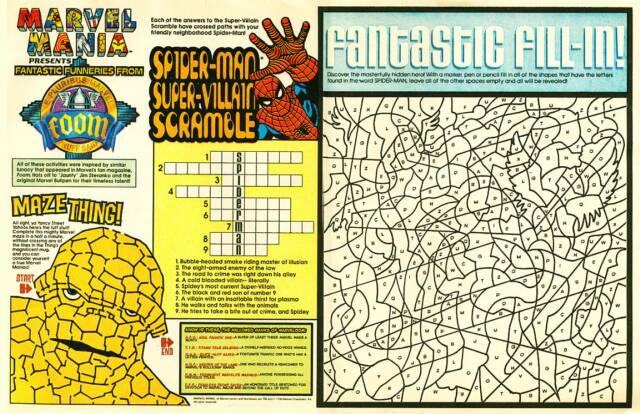
What we were left with, though, were the Kids’ Activity Book and Placemat. I started with the latter, aiming for an interactive piece full of puzzles, quizzes and games that children might enjoy – and maybe even their parents, considering the trivia questions that only fans of Silver Age comics would be likely to answer.
My favorite part was an action sequence with blank word balloons for the restaurant patrons to fill in as they saw fit. A battle between Spider-Man and Spider-Woman, for example, could become a humorous take on the banter between a husband and wife over, say, the right way to load a dishwasher.
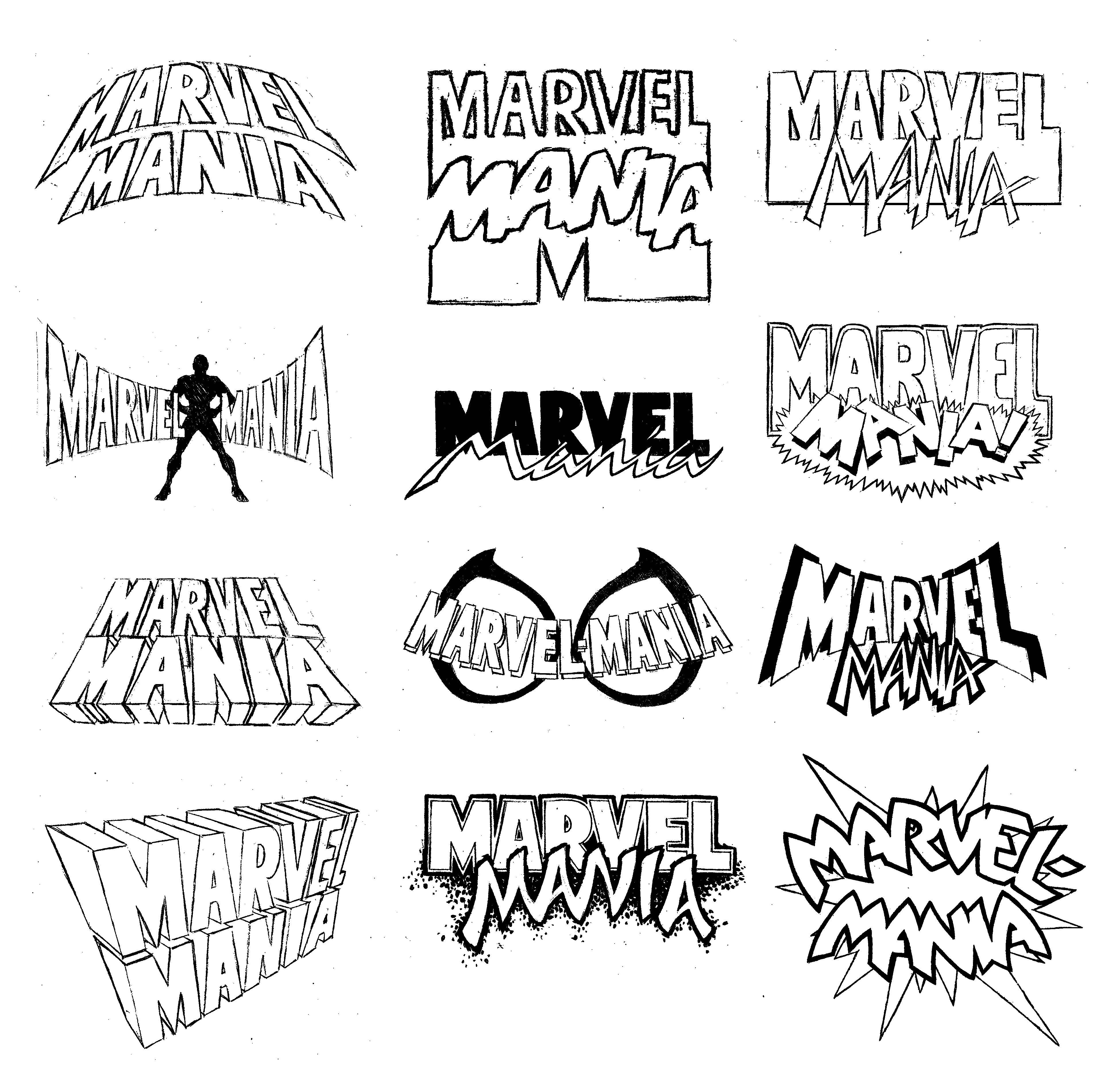
At the time, there was no accepted logo for MarvelMania – or so I had been told – so I spent some time working up a few options, trying to capture the feel of comic books and super-heroes. Gary submitted his choice to the gang at Marvel, who seemed surprised to learn I had made up the typeface -- which surprised me, considering how many examples of their own creative lettering I could point to (the cover titles for X-men and Spider-Man, to name just two).
JUST FOR FUN
Geek Gods
Creating the Modern Heroic Mythology
While I never actually got to work for DC or Marvel, I have had the opportunity to work on some hero-based projects as a free-lancer for the theme park and attractions industry. Some of them are highlighted here, but there have been many more for which the images are buried too deep inside my storage unit or have not been approved for release to the public.
One of these was a parade concept for Universal Orlando (before Super Hero Island was built), and would have featured various Marvel heroes in action. My favorite designs were a sleek motorcycle for Captain America and a version of the Fantastic Four’s fabled Fantasti-Car, which I proposed constructing out of four themed golf cart chassis that would split into separate sections, one for each member of the team, then re-combine as the parade progressed.
Comic book stores were starting to come into their own, as was the collectibles market, spurred in great measure by the unbelievable success of Star Wars merchandise, so it was not long before I was asked to conceptualize storefronts for both. I called one “Star Wares” and the other “Marvel Universe.”
They say a picture is worth a thousand words. Imagine how much impact the two together could have! How else to explain the phenomenal attraction of comic books and movies, where (at least in the case of the ones that are well done) good storytelling is married to eye-popping illustrations, the dance of the two forms of communication appealing to both the artistic side of the brain and its more
verbal counterpart.
It should come as no surprise, then, that movies based on comic books would be successful. It hasn’t always been the case, but in recent years, movie studios have taken
advantage of tremendous improvements in special effects to tap into the hugely avid fan base of comic books (which just happens to match the studios’ target demo-
graphic pretty closely). The result has been
an incredible renaissance in super-hero movies,
which in turn has had a positive effect on the
profitability of comic books and graphic novels.
I have been a fan of the super-hero genre
since I was a child. In elementary school, I
joined a small group of other kids who were
making their own comic books (and some
pretty clever Super-8 movies, to boot) that
they would try to sell to their friends.
Of course, we at Magma Comics (that's
Magma, as in molten rock, not the Japanese
graphic books known as Manga) didn’t have
access to photocopiers, let alone personal
computers – they hadn’t been invented yet –
so each book was a one-of-a-kind special
edition. We drew them in pencil, using stick
figures for the characters, and trying to make
them either as exciting as the ones we bought
down at the drug store or as funny as we could make them (hence such titles as Super-Dope and Super-Slob). I tried to be a bit more serious, creating straight-faced characters like wing-footed Mercury and the interstellar power-house Shooting Star.
Realizing that I wasn’t going to get hired by Marvel or DC to draw stick figures, I pulled a Todd Mcfarlane and left Magma to make my own books under the Cosmic Comics label, attempting to emulate the human-form work of Marvel’s Jack Kirby, John Buscema and Neal Adams. Naturally, being a kid, I fell short of the mark, but I still have a couple of issues of Shooting Star from those days (in pencil, with a color cover drawn in felt-tip markers), and though most of the art is primitive, every few pages there is a panel that shows some promise.
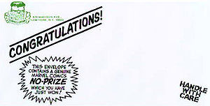
I kept at it long all the way through high school, teaching myself how to compose cinematic pages like Jim Steranko and write stories like Stan Lee and Gerry Conway. Along the way, I amassed an impressive collection of over 500 Marvel comics, paid for with earnings from odd jobs and found money (remember returnable pop bottles?). I wrote letters to the editor, and even managed to get one published (in Spider-Man #84, if you'd care to take a look). for which I received a coveted No-prize (basically, an empty envelope with a picture on the front telling me what it was),
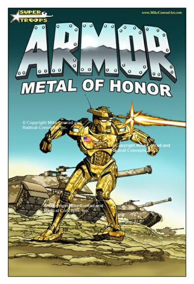
First off the drawing board was Armor, which I depicted as an iron-suited soldier – think Iron Man with desert camouflage paint job – blasting away at the unseen enemy with a mini-cannon mounted on his helmet. The angular design of the armor was based on the M-1 battle tank, from the turret helmet down to the tank-tread boots.
Next up was Infantry. The foot soldier predates all other types of warrior, so the tag line “First in Combat” was fitting both in a historical sense, and in reference to ground-pounders as the mainstay of the front line. Their heroism is intertwined with their patriotism, as reflected in the red, white and blue touches on the hero’s uniform as well as the bayonet-equipped flag he carries. He’s not the first super soldier to wear such an outfit (Captain America and Wonder Woman come to mind), but like the flag itself, he is an inspiration to the band of brothers following close behind.
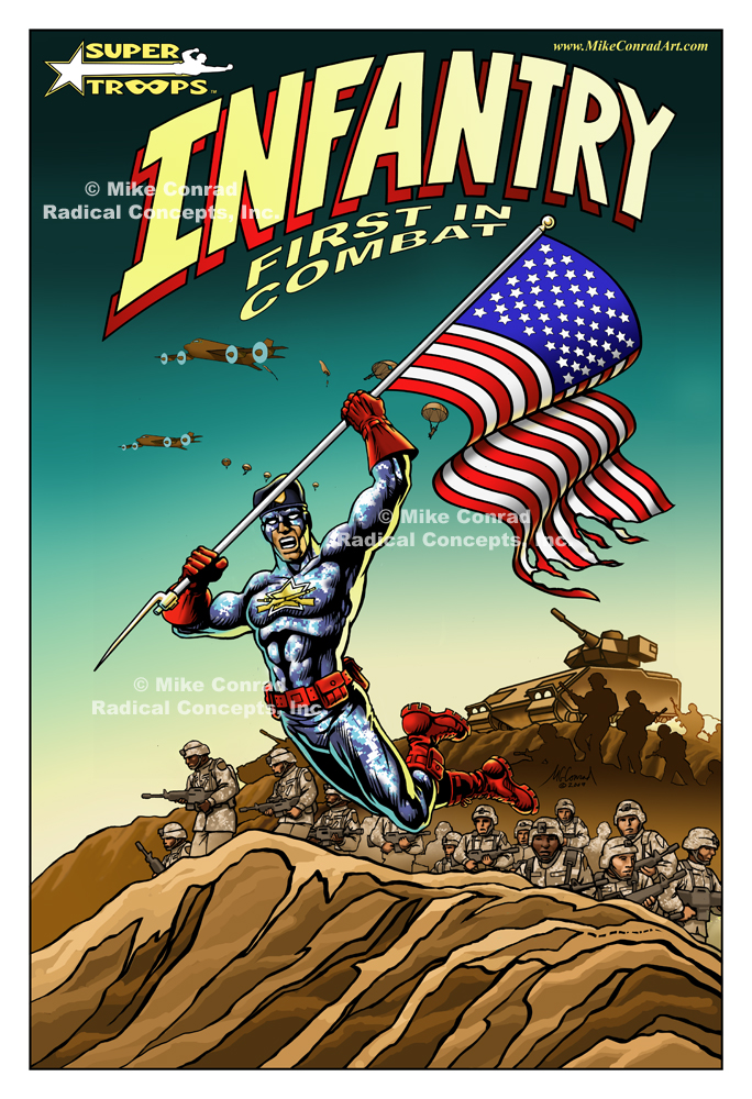
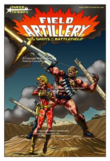
Unfortunately, the Army's vision wasn't quite so sharp. I sent them a brief outline of the idea, using these three samples, but they turned the it down without hesitation. Their rationale was that my prices were too high, even though I had yet to bring the subject up. They were not aware that I had done considerable research into the wholesale costs of printing and shipping posters of this type. Apparently, they had just gone to my website and assumed my usual price for art prints would apply to these posters, too.
I plan to give it another shot, but next time I'm putting the prices up front where they can see them without X-ray eyes.
Changing the Future
Space Cadet Franchise Gets a Reboot

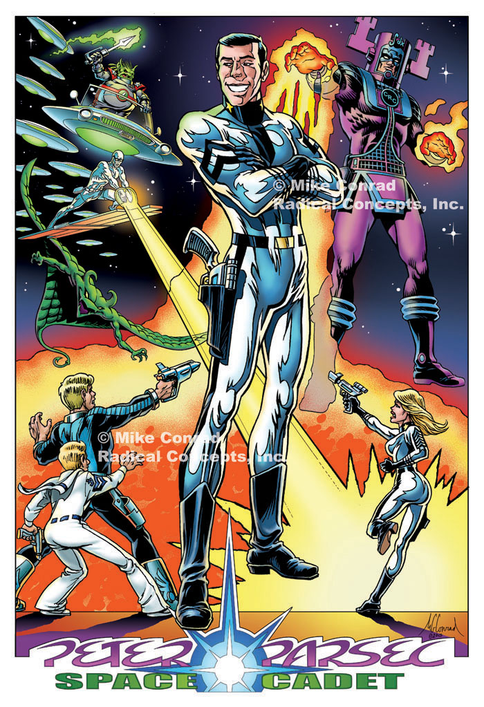
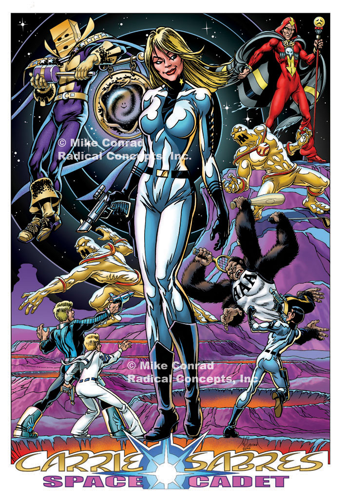
Readers of this newsletter may recall the article from Volume 2, Issue No. 2, describing the adventures of Peter Parsec, Space Cadet I wrote and drew back in my days as a West Point cadet, and the next-generation comic we published more recently, taking advantage of advances in desktop publishing and print-on-demand. Issues of that comic are still selling; just last month we had to put in another order (which gave us an opportunity to update the company ad on the back cover). It’s usually packaged with a CD of all the old adventures from The Pointer magazine, which, by comparison, are rather crudely drawn and hand-lettered.
This gave me an idea for yet another update. Following the trend in the comics and movie industries of occasionally re-booting their franchises to provide a different take on the heroes’ early years, I decided to re-imagine all the main characters – mostly the bad guys – and give each one a little bit of back-story that could be discerned through a more thoughtfully designed costume.
And although I would love to have the time to write and draw an entire series of adventures, I opted to put them all into a couple of montages in posters featuring the two real stars of the series, Peter Parsec and his high-ranking classmate Carrie Sabres (both of whom had experienced a couple of re-boots themselves, as they had missed so many classes on their adventures they were required to repeat their senior year twice – it was the only way I could keep them around until my class graduated).
A prime example of this is General Sna-Foo, the leader of an alien invasion from the Regulus System. On the CD of Classic Adventures, I had given the title “Against Regulus” to the graphic novel in which this battle was recounted, playing on the idea that cadets often found themselves in trouble for doing things that were against regs, or regulations.
So for this reboot, I worked on Sna-Foo’s design a bit, giving him a belt buckle with a feather, or quill, as the symbol of his home system. In cadet slang, “quill” refers to the act of writing someone up for a regs violation, which was probably done back in the old days with a quill pen. His head is also full of porcupine-like quills instead of hair, which makes a point or two about what’s going on up there.
There are some touches added just for fun, too, like the presentation of his private flying saucer as a classic sports car (complete with rear-view mirrors and an officer’s sticker in the window) and the glowing fountain-pen light saber that he has drawn from its scabbard. In the mind of this martinet from outer space, the pen is mightier than the sword.
Other characters appearing in the two posters are the supporting cast of Navel Midshipman Buster Crab and Air Farce Cadet Monte Zoomie, along with Killjoy (wearing a wet blanket as a cape), the multi-armed athletics-addicted Triple Ape, the mind-crushing Calculus and his hapless herald the Slipstick Surfer, the enigmatic Unknown Cosmic with his Gong of Eternal Absurdity, and the beast that started it all, the soporific Rack Monster.
True, these space cadets are not really super-heroes in the traditional sense, but then again, today's readers expect their heroes’ powers to be explained with at least a token of scientific rationale, making them more a sub-genre of science fiction than of fantasy.
A you would expect, all of the Peter Parsec adventures and posters are available on my website at www.MikeConradArt.com.
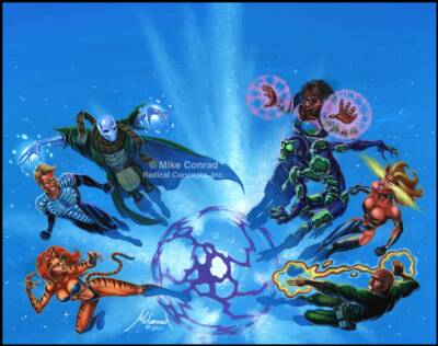
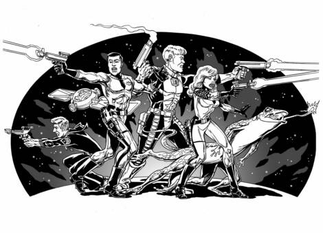
It was at one of these conventions that I picked up a commmission to paint a game master screen (the cardboard partition behind which the guy running the role-playing game consults the rules and inserts challenges for the players to deal with) for Blood of Heroes. This required depicting seven of the main characters in full color, based on some written descriptions and black and white sketches. Since the company' was Pulsar Games, I decided to show the heroes and villains facing off over a fanciful rendering of a pulsar.
As a cadet at West Point, I found an outlet for these creative urges in the pages of The Pointer, a satirical magazine published by cadets. Comic-book-style segments ranged from super-heroes (“The Adventures of UpperClassMan”) to horror (“Tales of the Uninspected”), but the one that really struck a chord was a sci-fi satire called “Peter Parsec, Space Cadet,” which ran for three years, including a 72-page graphic novel that was published and sold separately.
As a designer at ITEC Entertainment, working on ideas for a playroom for grown-ups, I championed a concept for one in which patrons could climb the Velcro walls like Spider-Man,sling foam-rubber hammers and flying shields around, crash through Styrofoam walls and high-dive into pits of foam rubber rubble. My boss was less than enthusiastic, telling me that comic books were for kids. The client concurred.
Of course, that was before super-hero movie and TV franchises started flexing their over-developed muscles. Ironically, the client for this project was Blockbuster, a company that is not around anymore, whereas the genre itself is doing just super.
So hitch up your spandex tights and come along for a fun-filled journey through some of the outlandish projects we've worked on in the never-ending battle to save the world from boredom and mediocrity.
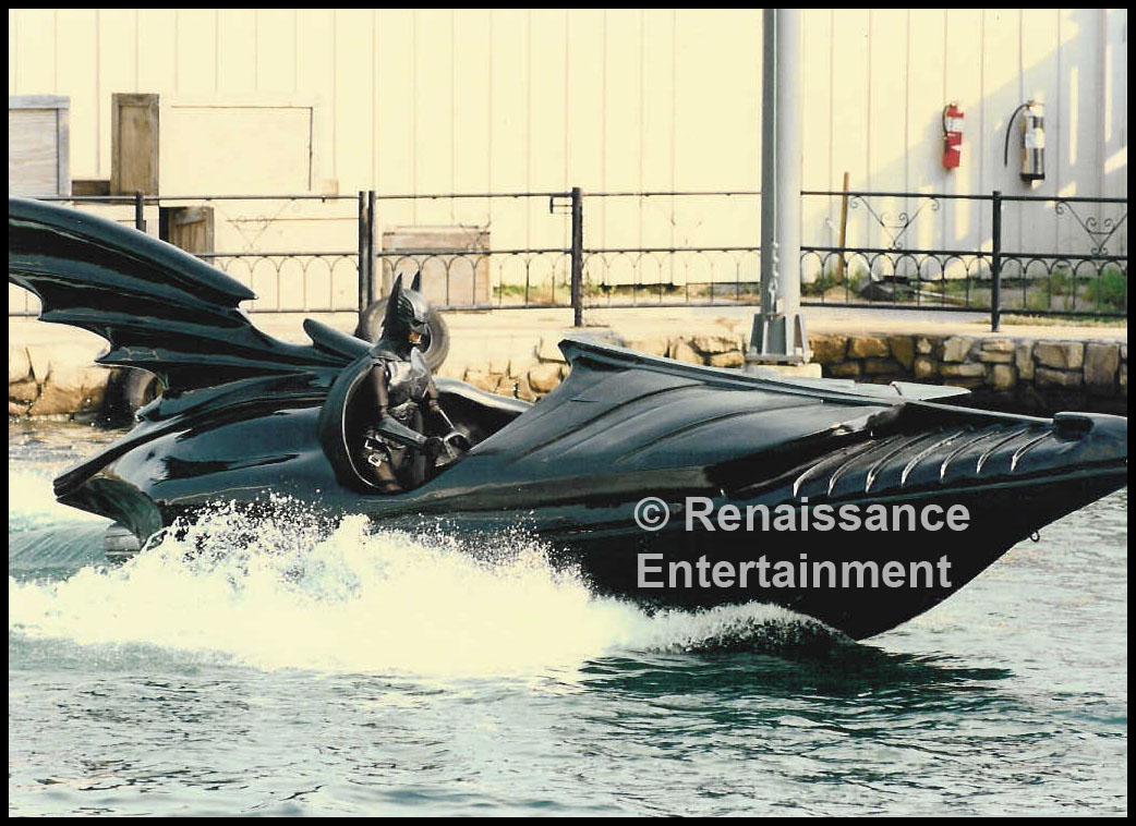
I cast my original plans (to attend a party to watch the annual Army/Navy game) out the window and hunkered down in my cave with a big piece of illustration board and a set of acrylic paints, determined to finish this thing by the afternoon deadline.
The extremely short timeframe spurred me to abandon my usual practice of drafting and then refining a series of roughs until the best possible composition emerges. To get this thing out the door in time, I allowed myself just one rough sketch, which I transferred immediately to the illustration board and began slinging paint.
There being little time for details, I concentrated on the action, filling the background with a huge explosion that reflects orange and red across the surface of the lagoon, where the Batboat slices through the waves. The Riddler is just a figure in the distance, riding atop a suspended cargo container that is spilling money, while in the foreground the Dark Knight rides a descender from his enemy's helicopter.
Fortunately, I did not have to design anything, which contributed to the speed of the painting, and I was extremely glad that I had long ago abandoned oil paints for acrylics, which dry almost instantly. As I recall, it took a total of four hours to paint this piece, and the client was very happy with the result.
Not long afterward, Jon asked me to do a quick rendering of the key effect of the show, when the giant inflatable head of the Riddler, which would be extending from the middle of a towering Brain Drainer device, began to deflate at the end of the battle.
Concepts rendering of the Riddler's demise as his oversized head suddenly deflates. © Renaissance Entertainment
Click here to add text.
Above: The Batboat, scaled down for stunts in the lagoon show, with the
Dark Knight at the helm. Below: The set as it was actually built, featuring the Riddler's Brain Drainer. © Renaissance Entertainment
I did this piece in colored markers, which are even faster, if not as realistic, as acrylics. But it got the job done, helping the client visualize the finale of the show.
I'm happy to say that the show was a big hit, the Riddler got his just desserts, and Batman, as usual, was triumphant.

Plant Man
A Company Leader
Empowers His Team
One of the most intriguing projects I’ve ever done was for PGA, a company that markets foliage to businesses, hotels and such. Gary Feibus, literally the plant foreman, sought to make their yearly catalogue stand out from the crowd with some kind of fun theme. One year, it was a jungle environment featuring caricatures of the staff in safari outfits, which I rendered in brilliant-hued water colors.
The following year, we decided to go for a super-hero theme. With a little bit of imagination and a lot of very concise writing, I created an alter ego for each member of the team, with names and super powers related to the specific talents that they brought to their jobs. Thus, the sales force was made up of the Peddler, who pedaled a high-tech bicycle, and Pitchman, whose diamond skills were an asset in any presentation.
In addition to a comic-book-style cover and a two-page spread introducing the PGA Team, I created a three-part story that consisted of three separate one-page episodes, each focusing on a part of the team confronting and defeating a different obstacle to good service.
The hardest part was condensing each tale into a single page stuffed to the margins with art and dialogue, but with a creative use of panel arrangement, the client was able to distribute a truly unique volume that showed off not just their range of potted plants, but the superior ability of the company to serve its customers.

Secret Identities
Who Needs a Mask When You Can Change Your Face?
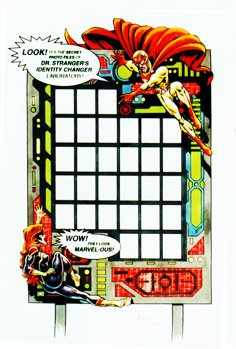
A vendor at Universal Orlando wanted to
theme its alcove in the park to fit in with
all the other venues on Super Hero Island,
so they put a signal up in the sky and we
came to their rescue. The business was nothing more than a face-painting station, but their main focus was to put hero masks and other comics-themed decorations on kids’ faces.
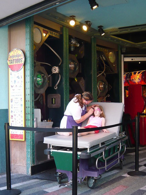
So to advertise this niche market, they wanted to dress up their niche with some kind of comic-book laboratory doo-dads and put a sign out front to display their most popular facial designs. Not seeming to care about the inevitable confusion with the Marvel character Dr. Strange, the client had decided to call the enterprise “Doctor Stranger’s Identity Changer,” and make it look like some high-tech gadgetry that could alter one’s appearance (for what nefarious purpose they didn’t say).
We took into account the shape of their narrow operating space and applied a healthy serving of the kind of whacky techno-gak that Jack Kirby loved to draw in the old Fantastic Four comics, with lots of glowing tubes and globes, gauges, buttons and vents galore, and a lighted sign overhead.
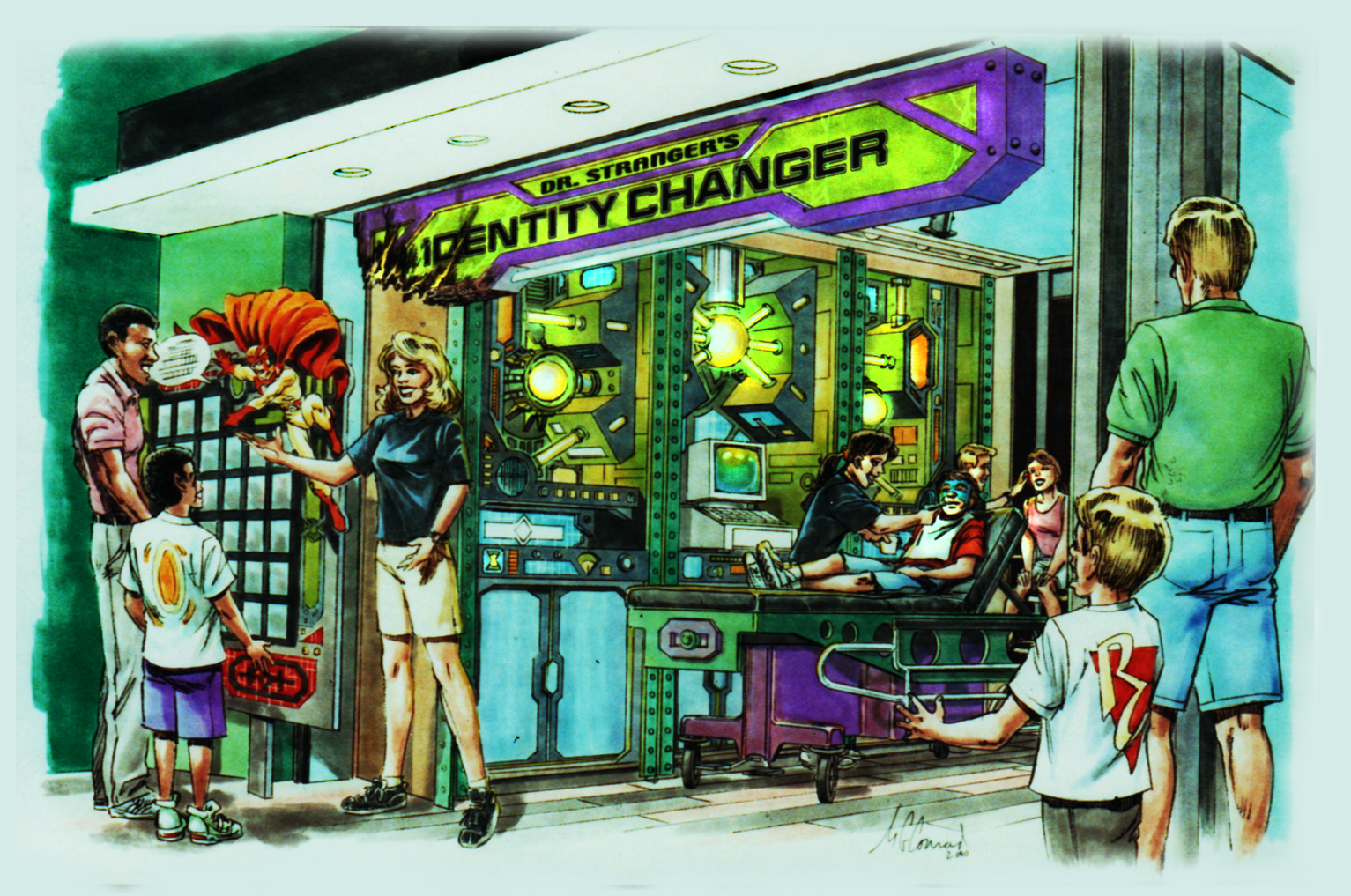
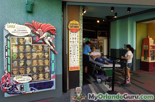
We did not have the opportunity to do any scale drawings, but the end result was fairly close to what we had designed; the advertising board, in fact, was printed as an enlargement of my original marker sketch.
Apparently, the idea of hiding one’s secret identity caught on, because this little bit of personalized entertainment is still a going concern.
For the advertising board out front, we created a pair of anonymous super heroes spouting corny dialogue at the edge of what purported to be a divided computer screen into which photos of the various face designs could be inserted.
Above: Marker rendering of the advertising board.
Right: The actual board with photos of sample faces inserted
Photo © MyOrlandoGuru.com
Concept rendering of the alcove with advertising board in place out front. © Radical Concepts, Inc.
Right: A customer drops in for a change of face
Photo © www.janetjong.com
Front cover of our design for the Kids' Menu and Activity Book, which could either be printed in color or left for the guests to do with crayons. © Planet Hollywood


.")


Kids' Menu: from concept to completion
Our original concept
The published menu
Click on an image to see a larger version
All images © Planet Hollywood and Marvel
Unfortunately, the Orlando restaurant never made it past the planning stage. The Hollywood franchise was closed after a year of marginal operation at a time when Marvel was facing financial troubles of its own, so I imagine the backers were reluctant to throw good money after bad.
One would think that such a venture would be a slam dunk today, given the current dominance of comic book heroes in the popular media, but I have yet to hear of any such plans. I'd say this is one of those times when we don’t need a real-life Iron Man to win the day; this is a job for billionaire Tony Stark.
We sketched out many alternate concepts for the logo, trying to find one with the right mix of energy, clarity and comic-book style. © Planet Hollywood
In the meantime, I got busy on the Kids’ Menu, which turned out to be a whole lot of fun to create. I was told to focus on making up activities for the kids to do while waiting for their meals to arrive, and leave the food portion for others. So I enjoyed myself making up another batch of puzzles and games and drawing pictures of Marvel characters.
In retrospect, the sketch of the Avengers for the coloring page was way too detailed, and the black background too untraditional. But the booklet, overall, is a work I can still point to with pride.
I have since had a chance to look at the actual menus for the California venue, and they show a remarkable resemblance to the rough ideas Mike Havekotte and I had dreamed up. There are pages on the Kids’ Menu that are obvious re-workings of my activity concepts; the characters may have been swapped out, and of course Marvel had their own people do the actual artwork, but the basic ideas are still there.
Apparently the decision wasn’t up to them. Mr. Earl chose a design that someone else had cobbled together out of random pieces of art from the comics pages. We tried to explain that it was too complex to be embroidered on tote bags and such, with all those details and colors driving up the cost of production., but the decision had already been made. For all I know, they had committed to that design before we 'd even started, and they just hadn't bothered to tell us.
Our concept for an activities placemat, with dialogue balloons for the guests to fill in, and a trivia quiz. Note the "official" logo in all its complexity. © Planet Hollywood
The published placemats
Click on an image to see a larger version
All images © Planet Hollywood and Marvel
Women of Power
The War Between the Sexes
Is Fought Among the Exes
TM
Back when I was starting work on the MarvelMania project, I decided I had been away from comic books for too many years and needed to do a little research, to see the latest changes in costumes, team line-ups, and so forth. So I walked into a comic book store and began perusing the shelves.
One thing that struck me right away (besides the fact that there even was such a thing as a comic book store) was the unbelievable proliferation of spin-off titles. Marvel, in particular, was guilty of this, publishing several variants on Spider-Man and an even greater number of X-men titles. In addition to The Uncanny X-men, which I had read growing up, there were X-factor, X-force, X-man, Weapon X, Excalibur, and more. In the Marvel version of Wheel of Fortune, it seemed you’d be much more likely to turn up an X than any other letter!
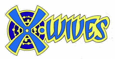
I joked that the only title missing was X-wives.
Then I thought about it a little bit. Maybe it was just that I had recently been separated from my first wife, or maybe I just wanted to poke fun at what I saw as an excessive explosion of X-titles, or maybe, being single again, I just liked the idea of drawing pretty girls in skin-tight outfits. But the idea rattled around in my head for a while, and I started roughing out a few concepts.
I recognized early on that for this to work, the characters all had to leave their husbands at about the same time, and realize that it was this separation that allowed their super powers to manifest. It was a good metaphor for feminine empowerment, which might even find some resonance among female readers. After all, this was a time when even Hollywood was beginning to find an audience for strong female characters, and women were finally making some headway within the nation’s armed forces.
After giving the matter considerable thought, I decided that the storyline needed to meet the following criteria:
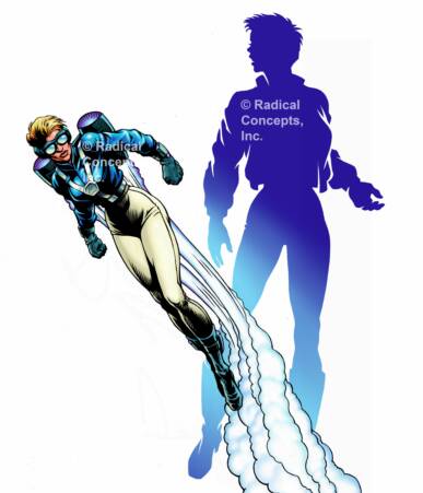
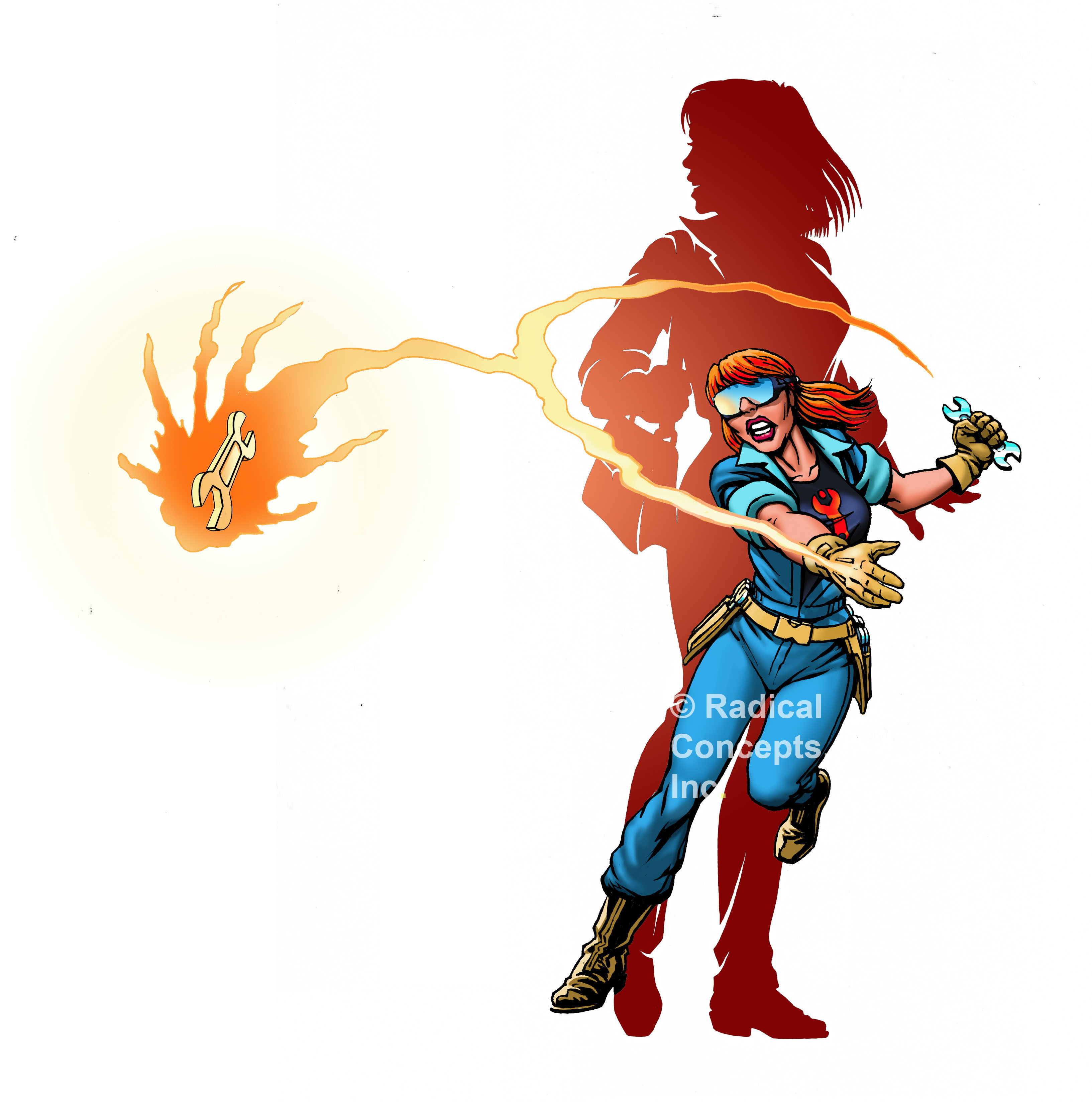
She throws like a girl -- with super powers. Spanner imbues objects with the ability to alter physical laws in close proximity, but the effects seem random; thus, her preference is to toss a spanner into the works.
Taking the high ground. Aerika creates vorttices that can push air (or any fluid) around with great force. She focuses these mini-tornadoes with hollow tubes, which allow her to fly through the sky and hurl concussive blasts at her opponents. But that's only a small part of her true power.
Unexpected results. .Witchever affects the balance of things, temporarily turning a particular aspect into its opposite: she can make hot things cold, reverse the polarity of magnets and turn up into down, but unfortunately she can't make a bad person good.
1. Be satirical, primarily to point out the absurdity of conventional ideas regarding super-heroes.
2. Present women in a positive way, even if it meant making the men in their lives look rather ridiculous.
3. Avoid clichés, except to make fun of them.
4. Show diversity among characters and their respective cultures.
5. Not be exploitative (meaning the women would not all have huge breasts and run around half-naked).
6. Use a serious take on serious matters, such as spousal abuse, while making light of those less deserving of a straight-faced approach .
7. Employ top-level design, illustration and writing – or as good as I could make them, at any rate.
The story is set in a fictional town that is basically run by an ominous military-industrial research corporation (think LuthorCorp with the power and ruthlessness of a company out of The Grapes of Wrath). The men working at the plant are developing ways to weaponize every scientific breakthrough they can squeeze out of their researchers, often trying these advances out on themselves.
Somehow, one of the more insidious developments manages to leak out and work its way into their wives and girlfriends, who up to now have been living in a sort of Stepfordesque suburb that is really just a company town with well-groomed lawns. I won’t reveal the nature of the change agent here, but it is equivalent to the ubiquitous radiation exposure that turned so many Silver Age civilians into super-heroes.
The husbands are aware of their women’s exposure, and, fearing some kind of side effect, they swap out all the wedding rings with high-tech ones that have the ability to keep any extra abilities at bay.
That works just fine until the day when one of the wives loses her ring and, free of its influence, begins to do things she had never thought possible. Before long, they are all shedding their wedding bands and developing awesome powers.
Meanwhile, it’s becoming clear that their husbands are working for a villainous organization bent on -- what else? -- taking over the world. And that is something these women cannot allow. So they band together, each contributing some talent or experience that the others might not have, such as the knowledge of martial arts, a knack for branding, a flair for camouflage and clothes design, and so on.
Believe it or not, these are not contradictory objectives. I was sure it was possible to present attractive women without making them all Barbie dolls or making them run around in glorified lingerie. There would be plenty of gorgeous women for the male readers to ogle, but there would also be confident, free-thinking, powerful women for the female readers to identify with – and they’d be the same characters!
Unlike so many comic book heroes, these women would not be out to fight crime. Oh, sure, they’re happy to lend a hand when an innocent victim is in need, but they have a purpose that is more fitting a super-team while at the same time being one of significant importance to them on a personal level.
Recognizing the advantages of a secret identity in this paparazzi-infested world, they work up some eye-catching costumes, reasoning that any observers would remember only the outlandish clothes and not the facial features of the persons wearing them. These are not the colorful spandex union-suits of
yore, but rather cleverly designed outfits with reversible jackets or split skirts that can be quickly wrapped around the legs to present an entirely different look, usually in different colors, from what passes for ordinary street clothes – and all in a matter of seconds.
There’s also some serious technology at work here, with one character able to alter digital records and erase the recordings from any security camera that might have caught one of the X-wives changing into or out of her costume.
A major challenge in designing these characters is the fact that so many such characters have been created in the past. It seems like all the good names have already been taken, even if by characters that weren’t anything like the ones I was coming up with.
For instance, I really wanted to use the name Spectra for the woman who manipulates all wavelengths in the electromagnetic spectrum, even being able to become invisible and pass through solid walls like an X-ray, making her name a play on the word “spectre.” But Marvel already had a character named Spectra, and DC had the Spectre. So I had to keep looking.
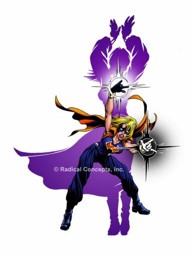
Presented here is a small sampling of the characters I’ve developed for this title, each shown in an action pose, backed by a silhouette of her in her "civvies" before the quick costume change.
I would love to draw and write this as a monthly title, or even as a graphic novel, but for one person to do all of that (and letter, color and publish it, to boot) would be an enormous undertaking. So I am seriously considering doing it as an illustrated novel, with the bulk of the pages done in text and illustrations every three pages or so. But if someone comes along who is willing to cover some of the cost, I could be persuaded to go with the more traditional approach.
© IDEA Inc.