Scale Drawings


PAST PROJECT
A completed job that we're still proud of
MIKE'S BLOG
Good/Bad/Ugly
Aliens on Screen
The essence of an alien is its strangeness – or, at least, that’s how it should be. Scientists and science fiction authors alike strain their human brains to imagine how life forms might evolve on planets different from our Mother Earth, and they’ve come up with some doozies. This imaginary menagerie has included such wonders as intelligent plants, intelligent crystals, intelligent rocks, intelligent fish, birds, octopi and slugs, and even (gasp!) intelligent machines. The most plausible of these – as far as actually representing something that was not born here goes – are the ones that are not bipedal humanoids.
Unfortunately, it has been a challenge to feature aliens in film and on television without resorting to human actors wearing masks or prosthetics, so the vast majority of aliens bear a distinct resemblance to good ol’ homo sapiens. On the other hand, this makes the characters more relatable to a human audience, which is good because we are not trying to entertain the people of Zeta Reticuli right now, and the sponsors would prefer we stick to our target demographic. It is especially helpful when we want to present the alien as a sympathetic – or even romantic – character, no matter that the prospect of successful interspecies mating is at best farfetched.
Unless otherwise indicated, all content © Mike Conrad or Radical Concepts, Inc.
GALLERY
Illustration and Fine Art from MikeConradArt.com
Vol. 6 No. 1 April 2019
ARCHIVE
Vol. 1 No. 1 (no longer available)
Military Caricatures (Humorous Posters)
Peter Parsec, Space Cadet (Satirical Comic Book)
More Bang for your Buck Rogers (Sci-fi Kluges Made from Trash)
Batman Forever (The Dark Knight Sees the Light in a Single Day)
Water You Lookin' At? (Mermaid Stunt Show Set in a Mystical Lagoon)
Fiberglass Menagerie (Creating Colorful Critters for Community Causes)
Tour the World (A Dark Ride that's on the Lighter Side)
Dinosaurs Make their Mark on the World (Cartoon)
To view previous issues of The RadCon Rapport, click on the links below:
Click on any thumbnail to view a larger image.
I've always wanted to visit outer space. Failing that, my wish would be to work on projects that have some connection to the Final Frontier. At the turn of the century, I finally had my chance.
As a designer working under contract to The Nassal Company, I was able to get my hands dirty (or at least smudged with graphite and paint) on a number of interesting projects for a variety of clients. One that stands out in particular was for a new exhibit at the Kennedy Space Center.
The folks at NASA wanted to get people excited about space exploration so that they would continue to support its funding and maybe encourage their kids to pursue an educational path that might lead them to becoming scientists, engineers and, yes, astronauts.
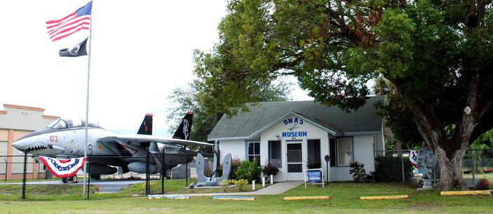
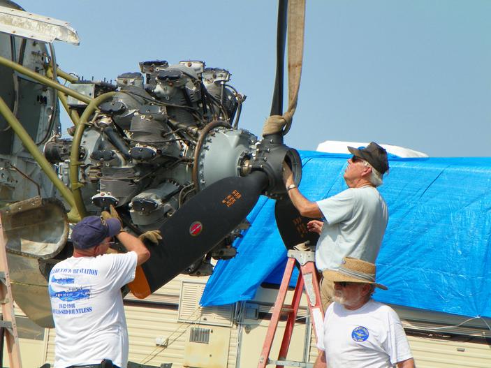
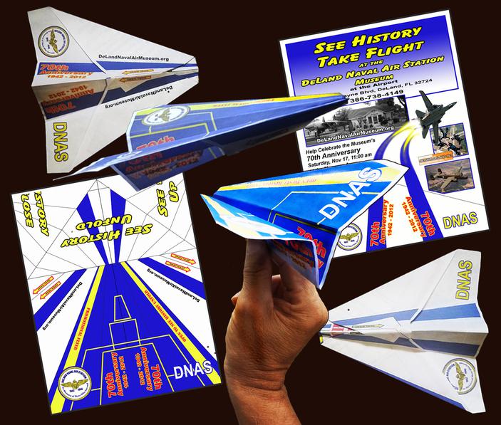
Above: A decomissioned F-14 Tomcat stands guard outside the DeLand Naval Air Station. Below: Cal Lancaster and his team of volunteers mount a new propellor to the engine at a high point in the restoration of the WWII vintage TBF Avenger.
"Answering Machine"
JUST FOR FUN
Battlefield Promotions
A Naval Air Museum Throttles Up its PR Effort
RECENT PROJECT
An example of what we've been working on lately
One thing you can say about America’s veterans: we stick together. Though there is plenty of rivalry among the various services, down where the rubber meets the road, we’re all on the same side. So when my father-in-law, a former Navy pilot, reached out to me, an Army vet, how could I say no?
Cal Lancaster flew jets in Viet Nam and was awarded the Purple Heart for the wounds he received on one particularly dangerous mission. After the war, he became an airline pilot an enjoyed a successful career before retiring as a senior captain. Not one to just lie around drinking mai tais at the beach, Cal sought a more meaningful pursuit and found it at the DeLand Naval Air station Museum.
Scouting Mission
The Cub Scouts marched in the parade every year already, and some had the privilege of riding in the museum’s restored jeep at the head of the formation. Armed with a couple of bags of our Flying Flyers, I climbed in with them and helped them sail the planes toward the crowds of children lining the street.
At one point near the end of the parade, the jeep lurched forward suddenly and I was thrown out of the back, hanging over the spare tire by one hand, barely saved from crashing to the pavement by one of the other adults. Fortunately, there were no casualties that day, except for the seat of my jeans, which had snagged on some piece of the jeep’s metal body and received a gash about a foot long.
The flyers turned out to be a big hit. I saw kids playing with them after they caught them, and several of the families showed up at the museum in the following weeks. We decided to launch a second sortie on Armed Forces Day, this time tossing the planes from the roof of the museum at the end of the official ceremonies.
To further encourage people to open up the flyers, I threw in an indication that a top secret mission was at hand. Inside was a trivia question that could be answered by visiting the museum, with a space for writing down the answer. All the kid had to do was show his answer to a designated secret agent and receive a prize. One of the prizes was a humorous poster I had made up about an Air Force pilot telling his war story. It was titled, “There I was. . .”
Theater of Operations
There were other promotional efforts that never got off the ground. Movie night, for example. I had thought the chance to watch a war movie with other veterans, and then chat about it over snacks or even listen to a guest speaker who had some special knowledge about the subject would draw an audience, but no. There was a surprising lack of interest, presumably because it was so much easier to simply download a film on Netflix.
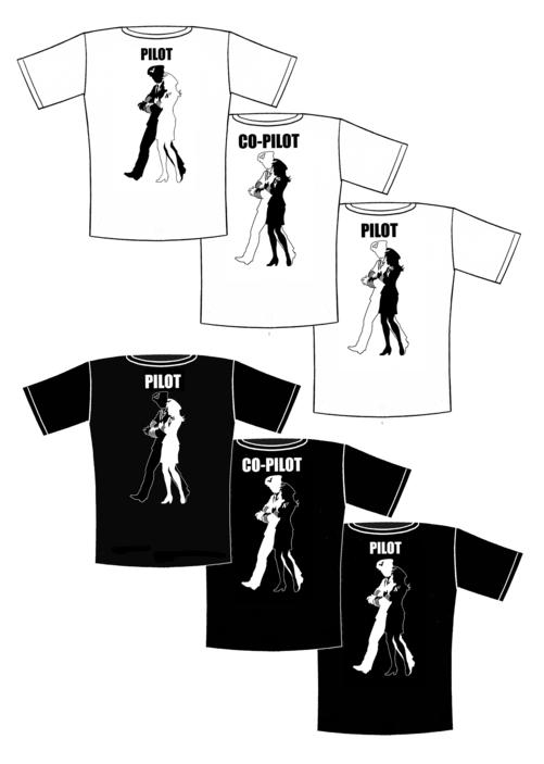
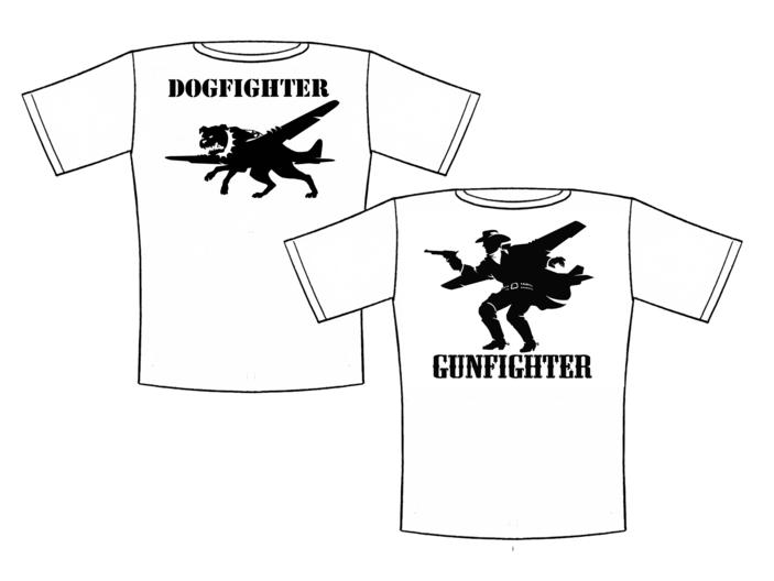
When I took on this job, I made a point of checking out military museums whenever I found myself in the vicinity. One thing that they all have in common (as do all successful museums, I believe) is the gift shop. Non-profit establishments like these augment the funds raised through donations and special events with the sale of all sorts of knick-knacks, books, posters and clothing items. I had already donated a box of posters to the cause, but I figured we could stand to offer some other items.
Retail Hooks
I drew up designs for some fun t-shirts, creating sleek one-color graphics (the cheaper the better, when it comes to printing) that might appeal to veterans and civilians alike. The Gunfighter and Dogfighter images were targeted at the Top Gun audience, naturally. The Pilot/Co-pilot series was oriented more toward couples, although not exclusively – a pilot walking arm-in-arm with a shapely member of the opposite sex could just as easily be an attractive single. The beauty of this design is that the Pilot label can apply equally to the female or the male character, so it does not have to be taken as a sexist comment at all.
The jury is still out on the t-shirt idea. The problem with clothing is that it is hard to predict how many of each size to order, especially with limited funds and even more limited storage and display space. I hope the new building will alleviate some of this crowding, and our promotional efforts will someday yield enough capital to support a viable gift shop. After all, if the museum’s name is on every item sold, then every knick-knack or piece of artwork becomes a promotional ambassador in itself.
If you are ever in the area, between Orlando and Daytona Beach, you should come by the and take a look at all the interesting exhibits. There is an F-14 Tomcat out front and a big PT boat off to the side, with a ton of other war memorabilia in between. Visit their web site for tour times and directions:
The DeLand Naval Air Station Museum -- where history takes flight!
Local attractions of this sort live and die by the patronage and generosity of the people in their surrounding communities. When Cal was elected President of the Board of Directors, he took upon his sturdy shoulders the task of pushing the museum’s growth and development forward and upward. He was instrumental in driving the construction of a new building to house the restoration efforts and oversaw the day-to-day running of many programs through the team of dedicated volunteers.
Cal convinced me to volunteer, too. I was elected to the position of Recording Secretary (an easy victory, since nobody else wanted the job), and realized that the museum could benefit from a more aggressive and cohesive public relations effort. So I proposed the creation of a Promotions Committee and was punished for my arrogance by being named the Director of Promotions at double my original salary (which was zero).
Getting a Purchase on
Things
Second Stage
Ignition
Kennedy Space Center
Leaps into the New Millennium
.
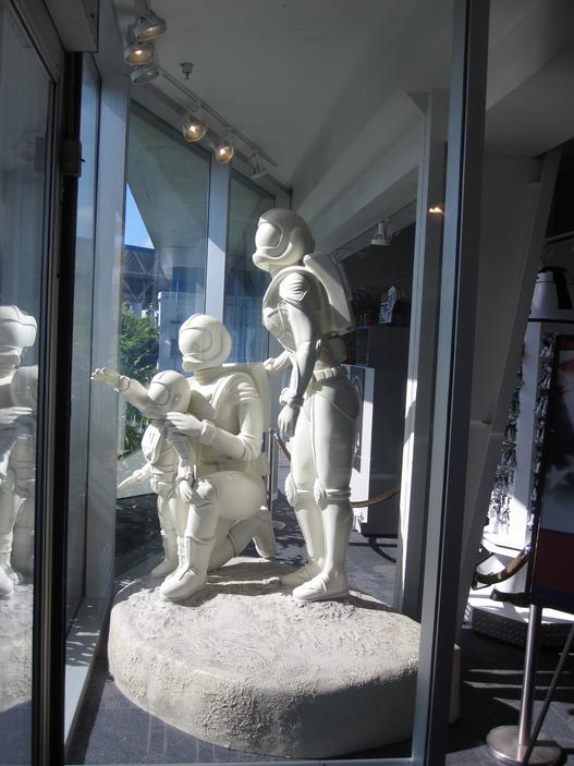
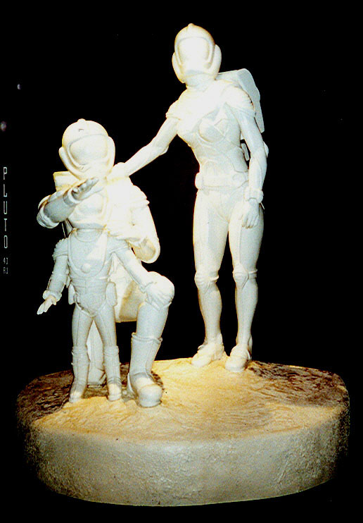
There was one other item that I got to work on, and it did involve a bit of futuristic imagination: the sculpture.
The idea was to present the Family of the Future in life-size 3-D to bring the whole idea of space travel down to earth – or at least make it something everyone could relate to. I drew up several concepts, including a version with a young boy hugging his loyal alien pet.
The winning design, though, was pretty simple: Dad kneels beside his child with Mom’s hand on Dad’s shoulder as they all survey the galaxy before them. Dad’s hand is extended out as if to say, “There’s a whole universe out there, my child; where you go from here is up to you.”
The fact that it is set in the future meant that we could put the people in space suits and leave their identities undefined; that way, visitors could picture themselves inside the suits and take some vicarious pleasure in the infinite possibilities of the future.
But it would work better if one was identifiable as the father and one as the mother, so I set the clock hundreds of years ahead and made the spacesuits much sleeker and more form-fitting than the ones we have today. I went even farther than that, making the lines of the male’s suit straight and angular while the female’s were gently curved.
Above: The main entry with one of the Passport kiosks before the colorful were applied.
Planes, Training, Autographed Stills
The DNAS Museum is a small historical attraction adjacent to the DeLand Municipal Airport in Central Florida. It was used back in World War II as a base for training pilot/gunner teams in the renowned SBD Dauntless dive bombers and the F64 Hellcat carrier-based fighters, among other planes. A small team of veterans from all branches of the military devote countless hours each week to maintaining and improving the museum, including the loving but labor-intensive restoration of a vintage TBF Avenger that had crashed into Lake Michigan on a training mission during WW II.
Click on an image to see a larger version.
The committee was made up of several Board members and a few other interested volunteers, all eager to do their part to get the word out about their beloved museum. We brainstormed some ideas, such as hosting a weekly movie night and making a big to-do about the museum’s upcoming 70th Anniversary. We already had some wonderful events on the calendar, including our significant participation in DeLand’s Veterans’ Day parade, a booth at various regional air shows, and the associated Hangar Dance, which was our very successful fund-raiser featuring big band music and a silent auction.
I suggested we stake out Armed Forces Day as our own territory, and the idea was accepted. Our team put together a multi-service program that included presentations from the mayor and other local dignitaries, participation from local ROTC and veterans’ groups, some activities for the kids, and whatever support we could get from the various recruiters, which included lots of giveaway items.
Vets in Vettes
The Veterans’ Day parade is a big deal in DeLand, starting off with a flyover of military planes (both historical and modern) down the main boulevard, and featuring all manner of rolling exhibits, and notable war veterans being driven in vintage cars and cars provided by the local Corvette club. The DNAS Museum had a Sikorsky helicopter from the 1950s, a miniature version of the PTF Fast Torpedo Boat (another of the group’s major restoration efforts) and a classic M3A1 Jeep. Kids in the audience were thrilled to see these icons of American military history, especially when the riders tossed pieces of candy their way.
Candy is dandy, but promotion needs a commotion (my apologies to Ogden Nash). What if we gave the audience something else, I reasoned, something that actually said a word or two about the museum, or even gave them a reason to pay it a visit?
Some parade participants handed out promotional cards, or slips of paper with their organizations’ information on them. Most people just threw them away. What we needed was something that a kid might hang onto for a little while, maybe play with it, and eventually get around to reading what it said.
The answer was a paper airplane.
The Flying Flyer
In my childhood, I had learned to make two kinds of paper planes that flew very well. One was great at loops and circles, and one was a reliable straight-line distance glider. Unlike most people’s paper planes, this model did not arc like a lawn dart and crash its nose into the ground, but wafted along on a surprisingly level glide path to end its flight with stately dignity. As Den Leader in my son’s Cub Scout pack, I had already taught the boys how to fold these origami masterpieces, and they had a ball tossing them back and forth across the playground.
So I already had a workforce in mind for my tiny version of the Northrop assembly line; all I had to do now was come up with a graphic design that would look like a fairly cool plane when folded up, and then unfurl into an information-packed flyer when a certain tab was pulled. I patterned the graphics off of the Navy’s Blue Angels exhibition jet team, and made it as easy as I could on the scouts by incorporating lines where the various folds would be made.
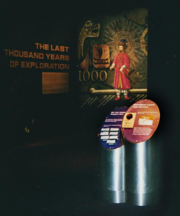
Below: The same kiosk with graphics applied and Passports in the slots. Note my choice of font for the exhibit in the background.
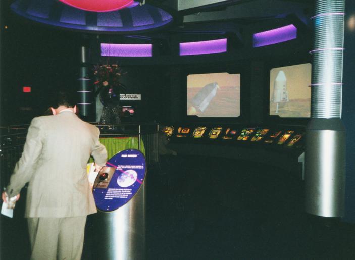
Below left: A kiosk in use during the grand opening event.
Above: The graphics for the "Sign Up for Mars" activity required a banked curve for the explanatory panel, which was made of stainless steel for durability and a high-tech look.
© 2018 JK Design Group
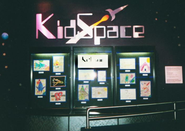
Above: The logo for the KidSpace, which features interactive games and art by school children, called for a computer-ish style font and a stylized rocket.
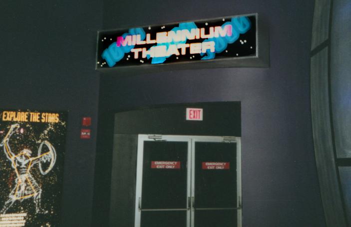
Below: The backlit sign for the Millennium Theater, which was showing
an effects-driven movie about a race through space.
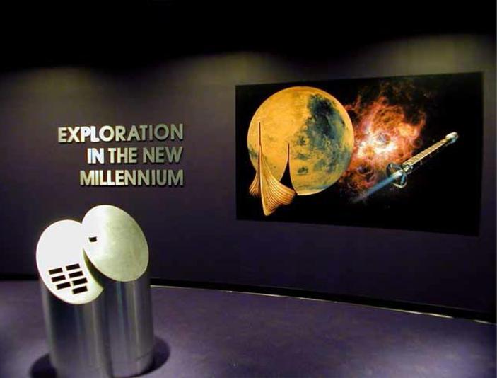
Above: The statue of The Family of the Future in its original location within the Exploration in the New Millennium exhibit. Sculpted by one of The Nassal Company's talented artisans from my schematic drawings.
Left: The same sculpture on display in one of the windows at the KSC Visitors' Center, years after the original exhibit had closed.
It was to be named Exploration in the New MIllenium.
Most of the design work had already been done by a couple of firms, including Delaware North, but we were brought in to fill in some of the gaps.
My part was primarily putting together the graphics for the various exhibits and learning kiosks. Since the show elements were already colorful, high-impact displays concocted by the likes of the set designer for the SF television show Babylon 5, I argued that the graphics should not be done in color.
It was a bit of a hard sell, but I was able to convince the client that the signage would stand up better to visitor interaction if it was all done with engraved metal of the sort that newspapers use in their presses. They would also be a lot cheaper and easier to replace.
So I used a nice, clean futuristic font (Eurostyle, as I recall) for the titles and non-clashing Arial or Helvetica for the body of the text, and it worked just fine. I did have to come up with some simple icons for the Passport stamps at the various kiosks, and colorful signs for a movie theater and the KidSpace.
I was also called upon to spec out the big, cut-out metallic lettering for the main exhibit entry title. Got into a bit of a discussion about that, too, with the original designer in California, but after the show opened, he was gracious enough to admit that my concept worked just fine. Unfortunately, the primary imagery for the entry – and all the promotional materials – were not up to the task of energizing the public.
The overall concept was solid: show a glimpse of how far exploration has come since the Vikings (1000 years ago) and where it might go a thousand years in the future. They could have chosen (or created) some more dramatic imagery for the main entry graphic (A Viking longboat without sails, a photo of the planet Mars, and a design concept for a manned spaceship that would be obsolete long before the millennium would play out), but the rest of the exhibit was pretty impressive.
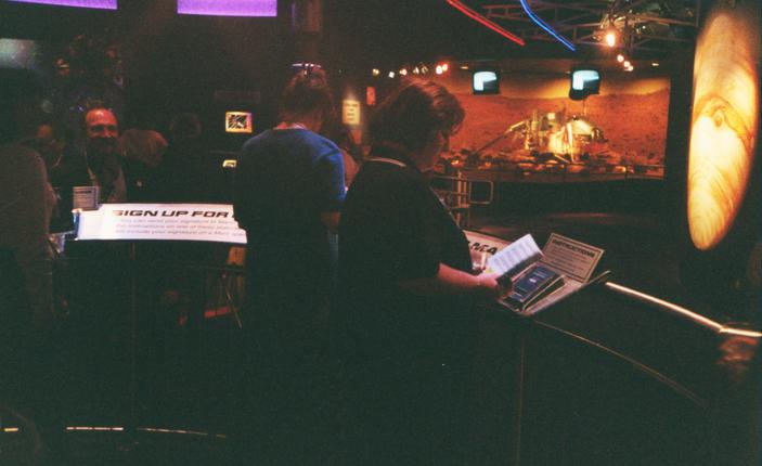
The Mars portion included a full-scale Viking lander (the Viking imagery continues!) and a piece of a meteorite that scientists are convinced came from the red planet. Guests were invited to touch the rock fragment and to add to Sign Up for Mars, adding their names to a list that would be sent on a future unmanned expedition.
As for the child, rather than do one of each gender, I realized that until the age of 10 or so, there is little difference in body shape, so I opted for simple circles and rectangles. The guy who sculpted the piece didn’t go along with this as well as I would have liked, but I did manage to get him to compromise. The result is a Dad whose suit is curvier than I wanted, but the differentiation is still there. Just more subtle.
I'm sure you have heard the joke that a camel is a horse that was designed by a committee. In this particular project, everybody and his brother was an art director. I was an art director; Nassal had a couple of art directors on staff, the representative from Delaware North was an art director, and so was her husband. All of these people had a legitimate say in the way this project would look (except for the last one), and they were not hesitant to advance their opinions.
I drew up a color sketch or two and made a few suggestions as to what kind of surface treatment the sculpture should have. After all, who knows what weird materials will be available for in the far future? The whole thing could be molded out of clear acrylic and lit
with bizarre energy effects from inside, like some outlandish space crystal, if we wanted. The sky, for once, was the limit.
So they had a meeting one night after I had gone home, and at the end of a long discussion, the choice was made: paint it white. Not marbled white, not white light as if it were a hologram. Just plain white paint on the fiberglass surface.
I enjoyed attending the Grand Opening of the Exploration in the New Millennium exhibit, and got a nifty little commemorative knick-knack out of it. I took some pictures, including one of the Family of the Future sculpture where the harsh overhead lighting makes it flare enough to look a bit like it was made out of energy or some exotic material, after all.
The exhibit was taken down years ago, but the last time I visited the Space Center, I was pleasantly surprised to find the sculpture on display in the window of the Visitor’s Center. I doubt it will still be there in a thousand years, but it’s made out of pretty durable materials, so there is hope. And isn’t that what this project was all about?
I am a fan of many genres, in books, movies and other media. But my most ardent passions enwrap the worlds of fantasy and science fiction, where imagination is not limited to the mundane but rather soars beyond the farthest vistas. And sometimes, that soaring is the whole idea.
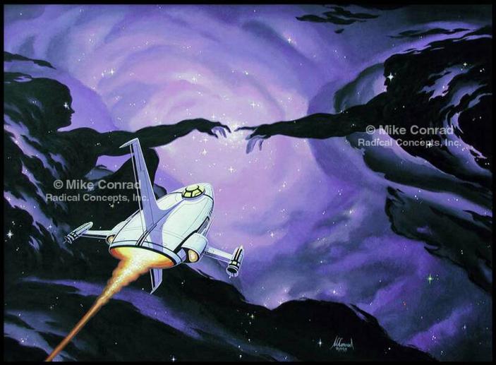
A quick survey of my work in the fields of fantasy illustration and fine art does seem to involve things that fly. Some are mechanical, others natural, still others supernatural. There is just something uplifting (ha!) about the defiance of gravity, the shedding of viscous planetary forces to climb above it all or to venture heroically into the etheric void in search of destiny. What’s not to love (as long as you don’t dwell on the dangers of falling back to earth or being destroyed by an alien armada)?
These are some of the paintings I have done over the years where wings and/or flying take center stage. All are available as prints (and some as originals) on my other web site, www.MikeConradArt.com , along with many, many other colorful pieces on a variety of themes.
Flights of
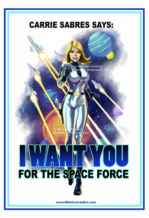
Space Force Recruiting Poster features a lead character in the Peter Parsec, Space Cadet comic book.
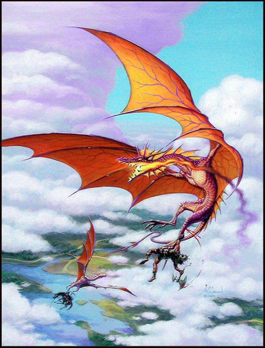
Chop Till You Drop: A valiant warrior makes a rather short-sighted attempt to escape the grasp of a hungry dragon.
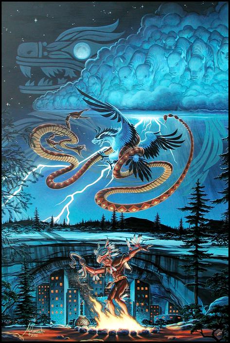
American Genesis tells the apocryphal myth of the Thunderbird's battle with the Earth Serpent to merge into Quetzelcoatl, the feathered serpent.
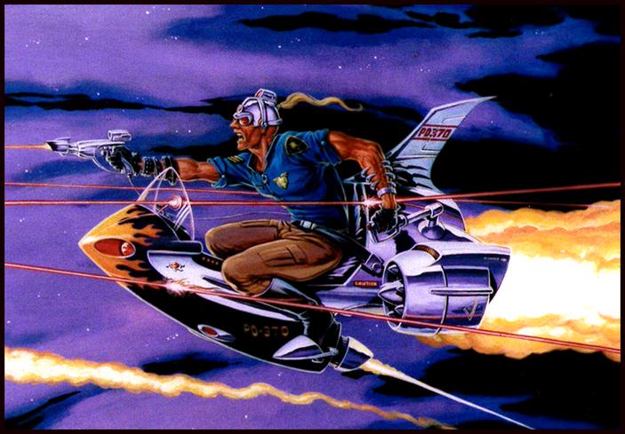
Hot Pursuit: A stratocycle cop of the future braves high-powered lasers in a high-altitude, high-speed chase in the name of justice.
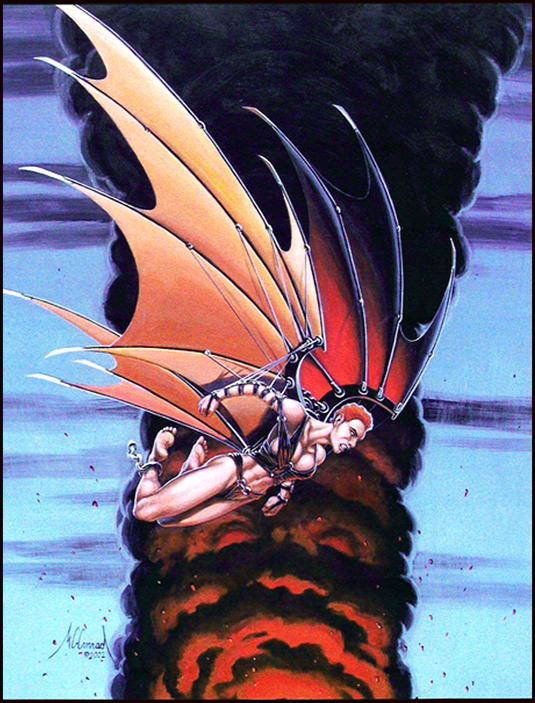
WingBlades: she managed to escape on home-made wings, but is determined to dive back into Hell to free the one she loves.
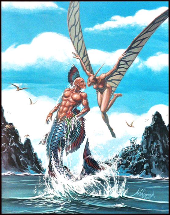
It'll Never Last is what both their clans are saying, but even the fleeting
ecstacy of a kiss is worth it for the merman and his pterodactyl girlfriend.
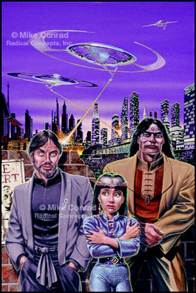
Divide and Conquer: Alien ships are on the hunt for their lost prodigy, but her exceedingly capable guardians have other ideas.
Adam's Quest borrows iconic imagery from Michelangelo in an attempt to portray Man's search for the answers to his most basic questions.
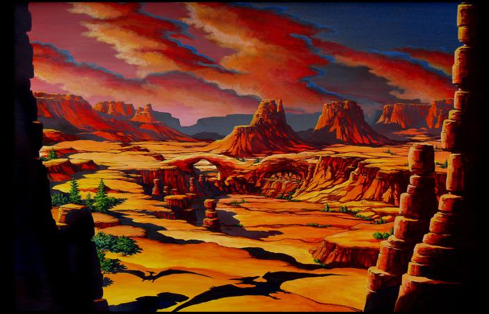
Ptera Incognito: The desert Southwest holds many secrets, some of which are older than the enigmatic Anasazi.
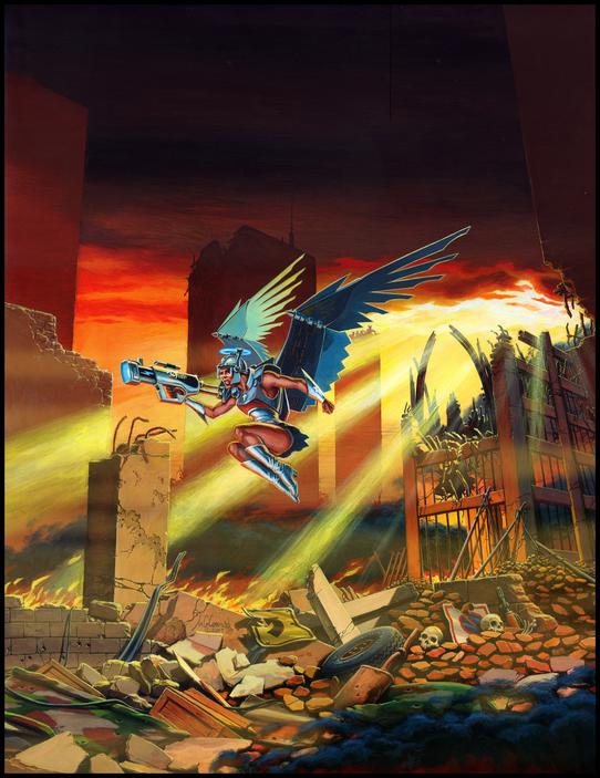
Angel of the Apocalypse: On wings of incorruptible metal, she soars above the battlefield, meting out justice for those responsible for the end of civilization.
When I was a kid (chronologically, not just in spirit), I loved to build models. The smell of airplane glue was comfort food to my creative mind, and the challenge of assembling little plastic parts into a sleek vehicular shape was truly a labor of love.
But still I longed for something more. I would look at the clever hot rod designs like Monogram’s Red Baron and Tijuana Taxi and say to myself, “I can do that!” Of course, I didn’t know anything about real cars, but even at that age, I had a knack for theming. So I’d cut up a plastic whiffle ball and marry it to the chassis of some ordinary model car, attach the propeller from a rubber-band airplane and paint it up like a police car. Voila! The Copper Chopper (or
Copper Copter – I never could decide which sounded better).
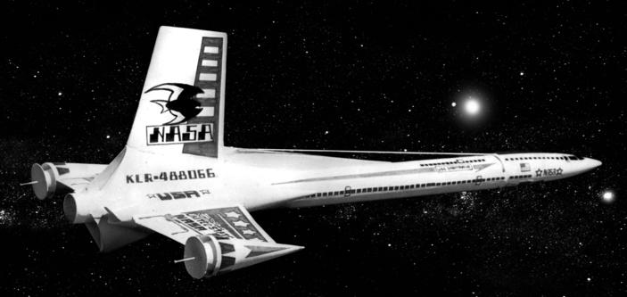
Later on, I discovered flying model rockets, and once again, the creative fires were lit. My big brother Ted built and flew a couple of kits, like the futuristic Mars Lander, while I ogled pictures of the super-sleek Interceptor and other so-called “exotics” (the ones that looked like spaceships out of science fiction) in the Estes and Centuri catalogs. The problem was I was woefully underfunded. Though I had managed to amass a sizeable comic book collection on found money and returned soda bottles, I didn’t have nearly enough to buy all the cool rockets I wanted. I had to come up with an alternate plan.
Reach for
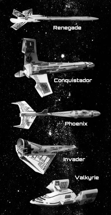
Some of my exotics, and the Valkyrie, which was not actually a flying rocket, but a model made using some of the same techniques.
Designs on the Prize
Estes published the monthly Model Rocket News, which featured among other things, the latest winner of the Design of the Month competition. The prize for this achievement was a $50 merchandise certificate – enough, I reasoned, to buy just about all the rockets and engines I would ever want.
So I set up my own little skunk works on a table in my bedroom and got to work. Purchasing balsa nose cones and fin stock, paper body tubes and plastic parachutes – along with all the other little tidbits that would be required – was a fairly reasonable investment. Naturally, I was only interested in creating my own “exotics,” some of which required me to shape special fairings and cockpits out of paper, and occasionally improvising other parts out of wooden golf tees or metal straight pins.
Along the way, I had to educate myself in the physics of rocket flight, with primary emphasis on how to achieve and maintain aerodynamic stability – the last thing I wanted was for my lovingly crafted missile veering off on a crazy loop or erratic tumble. The only prize a rocket like that could win was in the category of Most Dangerous. But there are ways to test this kind of thing, and I subjected every prototype to a rigorous trial that mostly amounted to tying a string around its center of gravity and swinging it around my head to see if the nosecone reliably pointed into the wind.
My first design was only a slight departure from the run-of-the-mill rockets, but I decorated with some fluorescent orange paint and christened it Flamestreak. It flew just fine, but failed to excite the Design of the Month judges, so it was back to the drawing board for me.
I tried to push the envelope with Yellowjacket, which sported a cluster of three engines for extra boost. It passed the stability test with flying colors (bold black and yellow), but the problem with clustered engines is that unless they all ignite at the exact same instant, they can throw the rocket off on an unpredictable course. The way to combat this, I later learned, is to make sure the engines are right next to each other. My design had the three engine tubes mounted around a central fuselage of just under an inch in diameter. Apparently, even that small amount was enough wiggle room for Murphy to sabotage the launch, and Yellowjacket swooped wildly to its doom.
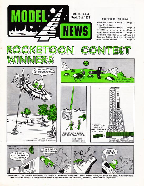
Then the Model Rocket News announced its “Rocketoon” contest, which I promptly entered, winning a Goony Bird kit and seeing my cartoon published in May 1973. As their name would imply, these Goony Birds were rather silly model rockets with short bodies and fat plastic nosecones. I had no desire whatsoever to build one of these “non-exotics,” but it wasn’t long before I found a use for the parts.
I attached the body tube and nosecone to the end of my revised Yellowjacket fuselage and added some custom paper features to the fins. Upon passing the stability test, I took my usual leap of faith and finished it out with a coat of white paint, gluing on custom decals that I had drawn by hand.
Imagine my relief as the newly minted Conquistador rose straight up into the sky. Now, imagine my horror as it arced over and fell straight down, the underpowered engine having failed to push the nose cone out and deploy the chute! My rocket slammed into the ground and instantly became about an inch and a half shorter.
Although all the damage had been confined to the front end, I had had enough of this particular configuration. It was time to move on.
Partially motivated by economics, I decided to try making a rocket without any body tubes at all. Instead, I took a rather large balsa nose cone that Estes had made for its Mercury Redstone scale model of NASA’s historic launch vehicle, and hollowed out part of its base to accommodate an engine tube, with a smaller nose cone projecting from the front. I surrounded it with six small fins, each of which terminated in a golf tee, pointed forward like an array of pointy weapons. Dubbing it the Gladiator, I tested it in flight, and immediately drew up the plans. It didn’t win the design contest, but it did garner an Honorable Mention in September 1972, which was encouraging. It came with a $5.00 merchandise certificate.
Striving yet again for an original design, I built a somewhat shark-shaped craft with a short, stubby front section (with the nose cone salvaged from the ill-fated Conquistador), tapering with a balsa adapter to a long, narrow body tube that ended in a squarish engine compartment bracketed by two sets of uniquely shaped fins. The forward section was flanked by a pair of sculpted-paper weapons pods with straight pins for barrels. As this model was built from parts resurrected from two prior wrecks, it was appropriate to name it the Phoenix. It flew just fine, and the recovery system functioned properly, but alas, it did not win the design contest.
Neither did the Renegade, a long, rakish spaceship with non-functioning engine pods that ended in huge, conical cowlings made of paper. I chose to think that all of these failed to win only because someone else had submitted a really superb design that month. To do otherwise would have been to give in to despair.
But that’s not the way I do things. Determined to build yet another sleek exotic, I turned for inspiration to a spaceship in a sci-fi graphic novel I had been working on. The body shape was altered from the traditional cylindrical tube through the application of sculpted paper fairings, and each of its wings sported a paper cone housing a rear-facing dish antenna, with a central signal collector made out of a straight pin.
Now, most rockets return to earth to land on their fins, which are necessarily at the rear of the body tube. This is achieved when, as the main thrust of the engine dies out, a forward-directed blast of engine propellant shoves the parachute and nosecone out of the front of the body tube, where the plastic chute opens up and lowers the craft to the ground. Sometimes, though, the rear fins can take a beating, especially if the wind causes the rocket to swing beneath the chute.
So to protect those delicate paper antennas, I decided to make the ship land horizontally by attaching the chute to a piece of string that was in turn attached to the outside of the fuselage at its center of gravity. The name of the starship, U.S.S. Sagittarius, was taken directly from the one in my unpublished story (chosen because it was on a mission to the Alpha Centauri system, which turned out to be inhabited by artificially created centaurs).
I drew up the plans, including patterns for the paper sculpted fairings and antenna housings, and submitted them to the Model Rocket News, only to see my unbroken streak of failure come to a sudden end. The U.S.S. Sagittarius won the Design of the Month contest for July 1974, and I was finally in possession of that coveted $50 merchandise certificate!
Alien Induction
It was about this time that the company inaugurated the Estes Aerospace Club, which had its own monthly publication, The EAC Spectra. Their Alien Spaceship Contest was right up my alley: draw a unique spaceship and write a short blurb about the planet it comes from and the alien race that built it. It didn’t have to fly, or even look like it could – a piece of cake!
I whipped up a drawing using some design concepts I had been toying with for a while, and wrote up a short description of a cyborg-ship (an idea I’d first encountered in one of Erich Von Daniken’s book Chariots of the Gods) called the Eirossis, and sent it off to The EAC Spectra for judgment.
Much to my delight, it won first prize and another merchandise certificate, this time for $75! How about that? I’d labored for years developing actual working rockets to finally pick up a $50 prize, and then with just a drawing and a few lines of prose, I earned 50% more!
The first place honors were shared with another rocketeer’s entry, but we didn’t have to share the loot, so I was totally fine with it. Our winning entries were featured separately, along with runners-up and honorable mentions, in two issues of the Spectra. Wealth and fame were mine at last!
© 2010 Essence’s Model Rocketry Reviews / David Montgomery.
© 1973 Estes Industries LLC
© 1976 Estes Industries LLC
© 1981 Estes Industries LLC
Then I got hit with a huge dose of irony. As a high school senior, getting ready to go off to West Point, I was already being encouraged to sell off my comic book collection (which, as you probably can surmise, would have been worth a ton of money had I kept it). Without room in my life for rockets, I couldn’t put either of the merchandise certificates to good use!
But a couple of years later, I hooked up with an extracurricular Model Rocket Club at school, and brought all my best rockets to New York when I came back from a visit home. I was way too busy to build any of the kits I wanted to buy, but my roommate Miguel was happy to take on that chore. So I ordered all the exotics and a few other interesting kits, and Miguel put them together. We took them out once in a while for launching, and conducted demonstrations at the annual Boy Scout Jamborees.
Then I graduated, and once again had to abandon my hobby. I bequeathed all the bought kits to remaining members of the club as I went off to Fort Gordon, Georgia for Signal Officer Basic School. Miguel talked his fiancée into storing my home-designed models in her garage until we returned, and I packed them in the sturdiest containers I could lay my hands on.
Five years later, when we got back together for a class reunion, we got hold of the girl’s parents (Miguel having divorced her some time before that), only to be told that they had cleaned out their garage and thrown them away just a couple of months before we called!
Kits Today!
Flash forward a few more years, and I was coming back to the States from a three-year assignment in Germany. On temporary duty at Wright-Patterson Air Force Base (you know, where they allegedly stashed the alien bodies recovered from the crash at Roswell), I decided to do a bit of exploring in the town of Dayton, Ohio.
Waxing nostalgic for the fun I’d had building rockets, I walked into a hobby store to see what was on the market. And there, among the other exotics, was a kit called the Alien Explorer, which bore a remarkable resemblance to my winning alien spaceship concept! It was longer, and simplified as you might expect in order to make it flyable, but those unique fin shapes, the pods on the ends of the side fins, the bulbous landing pod at its nose – those were defining features of the Eirossis. I bought the only one they had, and I still have it. Maybe one of these days I’ll bring myself to put it together and send it up.
Although I have since looked for the Alien Explorer kit in every hobby or toy store I’ve entered, I have never seen it on display again. But last year, out of curiosity, I did a Google search and found pictures and tales of it on some blogs, one of which pointed out that the Estes kit was actually a reworking of their Starship Andromeda, which makes a lot of sense. Take a proven design, tweak it with some additional theming, and presto! Another unique model rocket kit for the market.
I have found stories of people who liked the design enough to build their own from scratch, and photos of the ship being flown. There is even a mention of its origin, with speculation on whether or not I was ever aware Estes had marketed the kit. I’d answer that question with a resounding yes!
Of course, a standard requirement for all such contests is that the entrant agrees to relinquish all rights to the designs, so I have no claim on the vast riches Estes Model Rockets has raked in over the years from sales of my design.
But bragging rights? Yeah, I got those.
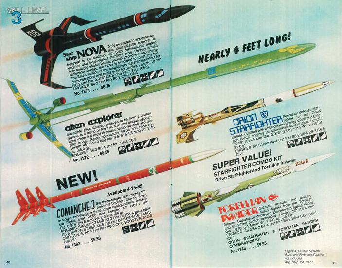
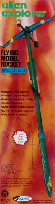
Left: The original packaging from the Alien Explorer kit I bought in Dayton. Right: A replica kit from PDRocketry being prepped for launch. Below: Pages from the 1981 Estes catalogue featuring the Alien Explorer among other exotics.
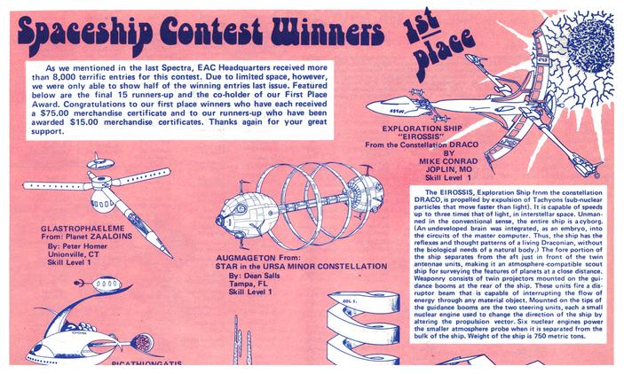
U.S.S. Sagittarius -- finally, a winning entry in the Design of the Month contest!
Pages from the EAC Spectra, announcing winners of the Alien Spaceship contest.
Fantasy
Model Rockets
Are Built to Fly
the Sky